Inlay hint colorings #5337
Comments
|
rust-analyzer server only provides the hint text and type, and the decorations are implemented on the client side. On VSCode client side, we separate the hints into 3 different categories (type, param and chaining hints), each having a separate style config. From the VSCode API point of view, the decoration styling boils down to the options defined in https://vshaxe.github.io/vscode-extern/vscode/ThemableDecorationAttachmentRenderOptions.html (this is what's used in In order to add the color, you need to add more options (with reasonable defaults for both light and dark themes) somewhere here: https://github.com/rust-analyzer/rust-analyzer/blob/5ca7cd9/editors/code/src/config.ts#L99-L107 and then use it in |
|
It is way simpler than you think. This way the user can control the color of the hints in "workbench.colorCustomizations": {
"[Default Dark+]": {
"rust_analyzer.inlayHint": "#a70000",
}
},Currently, this is the most granular way to do this, but it is simple to make it more configurable: Change the Probably add some user docs for this feature |
|
@Veetaha my gripe is with single color. I want multiple colors. Perhaps starting with giving typeHints, chainingHints, parameterHints a different color. (Also I noticed something else, I would like to hide parameter name hints for single argument functions, or two argument functions with different types if they are on single line.) |
|
On a related note, I wish the background color of the inlay hint was configurable. With a background color, it would be much easier to distinguish inlay hints from the surrounding code. I guess the slightly smaller font also helps to distinguish. |

|
Vscode doesn't provide an API to configure the font size of our inlay hints but changing the background color is doable (#5885), otherwise I suggest pushing the upstream issue forward: microsoft/language-server-protocol#956 |
5885: Make inlay hints colors more configurable r=matklad a=Veetaha **[BREAKING CHANGE]** Tackles #5337 (comment) and generally related to #5337. Added `foreground/background` color configurations with optional more specific overrides `foreground.(type|parameter|chaining)Hints`. One problem I see is that the config keys are long and don't fit into the on-hover hints in the `settings.json` file entirely... <details> <summary>Demo</summary> 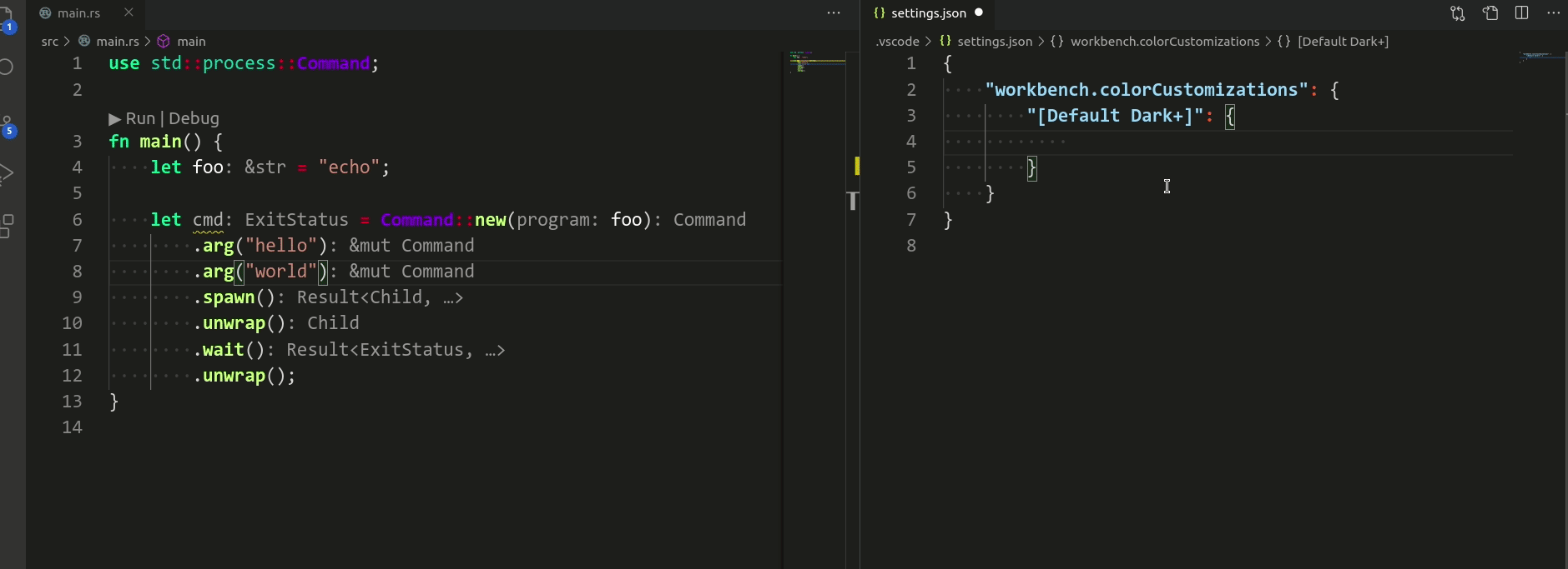 </details> Co-authored-by: Veetaha <veetaha2@gmail.com>
|
Configuration for this was actually implemented in #5885, background coloring as said is relient on the client offering such a feature(and judging from the issue it will never happen unfortuantely) so I'll go ahead and close this. |
|
For ones who wonder, edit settings.json adding (replace the theme with your preferred one): |
Suggestion: Have configurable inlay hint colorings. At least two: if the inlay hint pushes the text, it may have different color. If the inlay hint is at the end of line, have a different color option.
I've noticed a pattern: when the inlay hints comes at the end of the line, I want them to be more grayed out. But when they push out the text further, I'd like them to be way more visible.
Here is a classic case of this: #4079
Notice how the image:
Makes it looks like the indendation is wrong. This is because the inlay hints looks as if they are empty space, because they are so invisible.
Yet there is nothing wrong with the way inlay hints are in there, or with their indentation, it's just illusion because the color is so invisible.
If the inlay hints that push the text could be more visible it would make the indentation to look right IMO.
The text was updated successfully, but these errors were encountered: