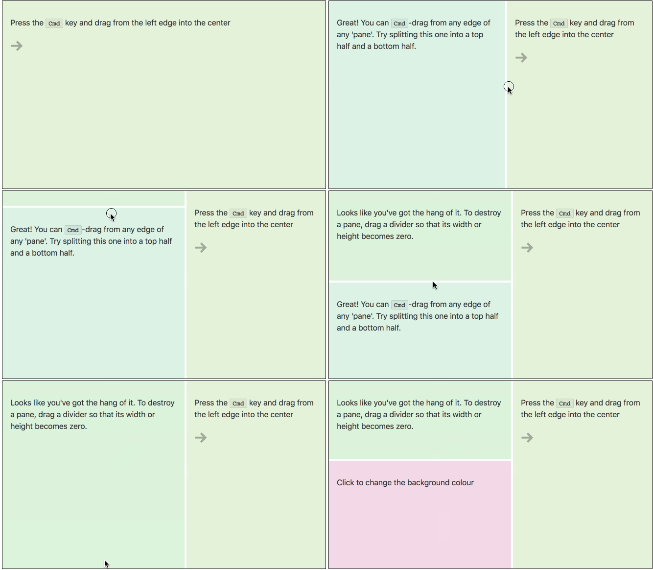
svelte-subdivide (demo)
A component for building Blender-style layouts in Svelte apps.
yarn add @sveltejs/svelte-subdivide<Subdivide component={Pane} />
<script>
import Subdivide from '@sveltejs/svelte-subdivide';
import Pane from './Pane.html';
export default {
components: { Subdivide },
data() {
return {
Pane
};
}
};
</script>The component constructor you supply to <Subdivide> will be instantiated for each cell of your layout. Typically, it would be a component that allows the user to select from a variety of different panes.
<!-- Pane.html -->
<div>
  {#if selected}
    <svelte:component this={selected.component}/>
  {:else}
    {#each options as option}
      <button on:click="set({ selected: option })">
        {selected.label}
      </button>
    {/each}
  {/if}
</div>
Note that this component uses CSS variables, and may therefore behave strangely in IE.
You can specify the following parameters:
thickness— the thickness of the divider, as a CSS length. Defaults to zeropadding— the amount of space either side of the divider that will respond to mouse events. Larger values make it easier to resize panes, but makes it harder to split them. Defaults to 6pxcolor— the color of the divider, ifthicknessis larger than zero. Defaults to white
<Subdivide
  component={Pane}
  thickness="1px"
  padding="4px"
  color="black"
/>You can also specify a layout parameter, to implement save and restore:
<Subdivide bind:layout component={Item}/>

<script>
  import Subdivide from '@sveltejs/svelte-subdivide';
  import Item from './Item.html';

  export default {
    components: {
      Subdivide
    },

    data() {
      return {
        Item,
        layout: localStorage.layout && JSON.parse(localStorage.layout)
      };
    },

    onstate({ changed, current }) {
      if (changed.layout) localStorage.layout = JSON.stringify(current.layout);
    }
  };
</script>You can listen for open, close and layout events. Each event is an object with a layout property and, in the case of open and close, a pane property indicating which pane was opened or closed.
<Subdivide
  component={Pane}
  on:open="console.log(`opened ${event.pane.id}`)"
  on:close="console.log(`closed ${event.pane.id}`)"
  on:layout="console.log(`updated layout`)"
/>If you're using webpack with svelte-loader, make sure that you add "svelte" to resolve.mainFields in your webpack config. This ensures that webpack imports the uncompiled component (src/index.html) rather than the compiled version (index.mjs) — this is more efficient.
If you're using Rollup with rollup-plugin-svelte, this will happen automatically.
Essential inspiration was provided by philholden/subdivide — thanks Phil!
