Das Modul Datenerhebung, -aufbereitung, -analyse soll die Lücke zwischen Rohdaten und visualisierbaren Daten schliessen. Den Schwerpunkt des Moduls bildet eine Einführung in die deskriptive Statistik. Ein kurzer Exkurs in die Methoden der Datenerhebung rundet das Modul ab. Teil des Moduls sind Hands-on-Sessions, in denen die Teilnehmenden den Umgang mit modernen Tools üben, um Daten einlesen, aufbereiten, vorbereiten und einfache Statistiken erstellen zu können.
The following are notes in English from this workshop at the Bern University of the Arts on 14 April 2018.
The data collection, preparation and analysis module intends to close the gap between raw data and visualisable data. The module focuses on an introduction to descriptive statistics. A short excursion into the methods of data collection rounds off the module. Part of the module are hands-on sessions in which the participants practice the use of modern tools in order to read in, process, prepare and create simple statistics.
We recommend installing Anaconda if you have a modern laptop with at least 4 GB, ideally 8+ GB RAM. It comes with Anaconda Navigator, which along with the conda command line tool makes installing Python packages for data science easier. Alternatively, students were encouraged to install a modern browser and login with a (free) Microsoft account to Azure ML Studio.
In the workshop, we mostly used Anaconda and Binder (beta) - which provides free, time-limited access to live Jupyter notebooks in the cloud, to work on code exercises. You can use the notebook in this repository to get started, by putting the full link to this repository, i.e.
https://github.com/schoolofdata-ch/hkb-dataviz
and clicking the launch button. Note that your changes will not be saved, so you need to Download your notebook from the menu if you want to keep any of your work.
After an introduction to each other and our learning interests using the School of Data "Advanced Data & Dragons" worksheets, we had a discussion about the various tools and programming languages involved in working with data, and what kind of things are worth paying attention to when setting out to learn a new tool.
Image: Cisco
Keeping in mind the pervasiveness and explosion of usage and interest in data, we discussed concepts like open data and big data, open source and enterprise software, levels of abstraction, and our shared goals in combining analytical techniques for communicating with evocative design and data visualization.
Two "mindsets" when dealing with data challenges were presented:
- A Philosopher's Stone approach, if not searching for "the essential secret of the universe", then at least attempting to use epistemic approaches, which prioritize aggregating sources of information in structures that allow interoperability and wide-reaching access as Linked Open Data.
- A Stone in a River mindset in which data is considered a part of the natural order of "impermanence and change", where a sampling of data has a different result from day to day, and in fact changes the data itself as per the Observer effect from quantum physics. In this mindset access to streaming data sources like the Twitter firehose are of primary interest.
These points were followed with an overview of the Swiss Open Government Data program, a look at featured applications and several open datasets on the portal:
- Consultations by gender, age and nationality
- Data inventory of the Federal Administration Data
- Results of the opendata.admin.ch survey
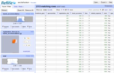
Our introduction to data wrangling for visualization began with OpenRefine, an open source, web-based tool for tabular data widely used in the Data Journalism community. We loaded in some data and looked at how it helps to convert, explore and correct datasets, while crucially keeping track of the history of changes. Experiences were shared from real life projects like Pharmagelder.
We then covered the steps in the School of Data Pipeline as a generalised method of data wrangling which emphasizes goal-setting, validation/source-checking and careful cleaning of datasets. Some of the advice shared for finding good data to visualize included:
- Start with a good question. Think about how Wolfram Alpha and Google search use Structured Data to respond to natural language search queries with rich search results.
- Understand why crowdsourcing works. Explore data from Citizen Science projects like the ones in Zooniverse. Compare this with efforts to collect quality information from a globally distributed user base like Wikipedia / WikiData, OpenStreetMap (10th anniversary video on YouTube), or OpenCorporates. Think about the standards that enable "crowdsensing" initiatives like MakeZurich.
- Explore Public Data, from Amazon to Google and Kaggle, companies around the world use contests (hackathons), data portals and web service interfaces (APIs) to share their data troves, with various strategic purposes in mind, but also to the great benefit of researchers and the curious. The Swisscom and Swiss Post portals were demoed.
- Think about what affects the quality of data. Understand the issues surrounding Copyright and other terms of use.
- Consider that authenticity is a particularly stringent question, as outlined (for example) in this 2013 Wired article: "more and more business decisions are based on the analysis of external data", "big data created externally is .. more vulnerable to theft and tampering than if it were created inside the corporate firewall", "organizations must validate duplicate sets of data and be able to respond quickly to any invalid data set", "cybercrime has emerged as a very profitable business for criminals — underlining the growing need to validate and verify all kinds of data", "a solution needs to ensure that the data is indeed what it portrays itself to be, meaning that no third-party has purposefully or accidentally changed what has been agreed upon and documented."
Most of the workshop morning was spent explaining the particularities of and setting up Python, Pandas and Jupyter on the various laptops. While more experienced Python users in the room started reading in datasets, we had a mini-intro to Python programming, covering basic types and operations, lists, dictionaries, flow control, and loading modules.
Quick dives into Python environments and version control (GitHub) were made along the way. However, our focus was on descriptive statistics, which were possible in a a couple of lines of code using Pandas read_csv and the DataFrame's describe() functions.
Our initial sample is available in this repository, towards the top of klasse.ipynb
This roughly followed the excellent SciPy introductory lectures, which are recommended along with courses from Software Carpentry and a new one by Luke Thompson, as well as the O'Reilly classic Python for Data Analysis text.
After a lunch break, we talked about Frictionless Data, a standardization initiative that aims to improve the way public and open data is distributed, published and made more accessible. Drilling into a few Core datasets on Datahub.io, such as Pharmaceutical Drug Spending by Country, it was suggested that the more experienced Python users in the class try Datapackage-py to load in some data by schema-first.
With a quick recap of the importance of Data structures, we focused on wrangling and visualizing data. Our focus switched from console coding to using Jupyter and JupyterLab. The history of digital notebooks for scientific computing was quickly covered, from MATLAB and Mathematica, to iPython and R Notebooks today.
"A loose acronym meaning Julia, Python, and R. These programming languages were the first target languages of the Jupyter application, but nowadays, the notebook technology also supports many other languages." (Angus docs)
There was lots to ground to cover, from Jupyter kernels to the 135'303 PiPy packages on offer. Questions were asked about alternative IDE's, so in discussion we mentioned Apache Zeppelin, Yhat Rodeo, PyCharm and Atom/Hydrogen - all great interfaces for working on data projects. By the way, check out Markus Schanta's Awesome Jupyter list for lots of links to related tools and tutorials.
While several participants were already using Pandas plotting functions and Matplotlib to render their data beautifully, we discussed some reasons behind the large variety of frameworks and libraries for data visualization in Python.
The Grammar of Graphics, a dataviz concept spanning languages, was something that we tried to understand in the course. Read the excellent introduction by Liz Sander (recurse.com) or explore Python Graph Gallery to get an appreciation for how a standard set of plots can be combined to make data speak concisely, correctly and in a way that allows for aesthetically pleasing and flexible designs. Or read the 2010 paper by Hadley Wickham for a more systematic perspective.
While Matplotlib, Seaborn, Bokeh, and others offer sensible and versatile approaches to the problem of graphing data, we considered the way D3.js, particularly through the efforts of Mike Bostock, has led to a supportive community and a rich palette of reusable open source data visualizations, that were nevertheless hard for beginners to code read and extend.
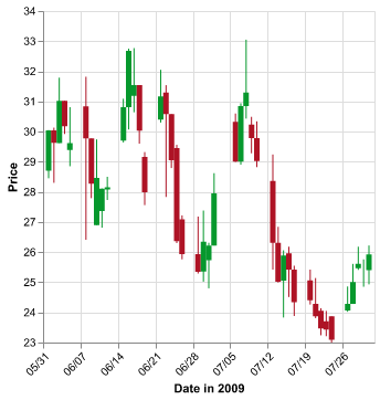
Implementing the theories of the Grammar of Graphics, the JSON based Vega project, well described by Paul van der Laken, and today extended into Vega Lite, has found its way into the Python world through the Altair package.
Altair is a Python API based on Vega-Lite, and is useful for rapidly creating statistical graphics visualizations more comparable to hand-coded designs built with D3 or Processing.
We were convinced by the outstanding documentation and examples, and tried to install Altair on our machines, however this led to general dismay as errors or other technical difficulties prevented it from working for many of the participants, mostly through a confusing process of integrating with Jupyter that the final 2.0 release will hopefully soon resolve.
The example notebook we worked through is available in this repository, in the second half of klasse.ipynb
In the workshop we only briefly skimmed the subject of Scikit-Learn, the biggest compendium of data science recipes, caught small glimpses of cool tools like Datashader/Holoviews or Plotly for Python, and hopefully despite the torrent of information the participants gained some insight into the thought and effort that goes on to publish and support good data sources, as well as opening the door to using Python and it's huge toolboxes/sandboxes of packages for data exploration and visualization.
Fernando Arturo Torres defined interactivity as, "a particular medium's ability to facilitate the properties necessary in an ideal conversation", and so my own main takeaway from the workshop is the effect of Creative limitation on our work as visualizers and communicators of information.
While choosing the best tool for the job is important, we need to settle on something and learn it deeply (no pun intended), until we find ourselves at ease, in the flow, exploring data in a natural and relaxed way. Something that everyone, including our course participants, will hopefully come to experience on their own terms.
Thanks to HKB/BFH, and especially to Oliver Hümbelin and Fabienne Kilchör for making this workshop possible.
Here are some fun activities to try and Jupyter notebooks to go explore next:


