A live demo can be found at: http://seanhuber.com/demos/bs-tab-modal/demo.html
bootstrap-tab-modal is a jQuery widget that displays a Bootstrap 3 modal with tabs.
Bootstrap version >= 3.1.0 (it has not yet been tested on Bootstrap 4).
jQuery version 1.9.0 or newer.
throbber.js: https://github.com/aino/throbber.js
With Bower:
bower install bootstrap-tab-modal
Or grab the scripts and styles and manually insert them in <head>:
<script src="bootstrap-tab-modal.js" type="text/javascript" charset="utf-8"></script>
<link rel="stylesheet" href="bootstrap-tab-modal" type="text/css" media="screen" />
Or if you are using Ruby on Rails, this widget has been packaged into a ruby gem (thanks to the folks at https://rails-assets.org). Add to your Gemfile:
gem 'rails-assets-bootstrap-tab-modal', source: 'https://rails-assets.org'Run bundle install and then update your asset pipeline.
Add to app/assets/javascripts/application.js:
//= require bootstrap-tab-modalAdd to app/assets/stylesheets/application.css:
/*
 *= require bootstrap-tab-modal
*/<div id='tab_modal_anchor'></div>
<script>
$('#tab_modal_anchor').tabModal({
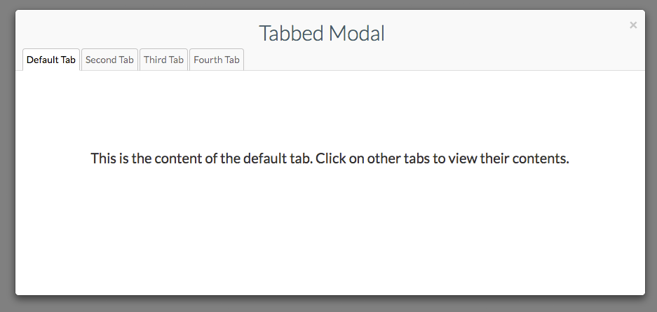
header: 'Tabbed Modal', // html string or function that returns an html string
tabs: { // properties are unique tab ids, values are tab options
first: { // the tab id
label: 'Default Tab', // label of the tab
active: true, // set to true if this is the default tab
showTab: function() { // callback for when user clicks on the tab for the first time (auto-clicked if default)
// in this callback it might make sense to do an ajax call and then call setTabContent in the response
$('#tab_modal_anchor').tabModal('setTabContent', 'first', "<div class='default'>This is the content of the default tab. Click on other tabs to view their contents.</div>"); // setTabContent takes 2 arguments: first is the id of the tab, second is the html content
}
}, second: {
label: 'Second Tab',
showTab: function() {
$('#tab_modal_anchor').tabModal('setTabContent', 'second', "<div class='second'>This is the content of the second tab. Click on other tabs to view their contents.</div>");
}
}, third: {
label: 'Third Tab',
showTab: function() {
$('#tab_modal_anchor').tabModal('setTabContent', 'third', '<h3>Third!</h3>');
}
}, fourth: {
label: 'Fourth Tab',
showTab: function() {
$('#tab_modal_anchor').tabModal('setTabContent', 'fourth', '<h3>Fourth!</h3>');
}
},
}
});
// show() displays the tabbed modal. It often makes sense to put this in a click handler.
$('#tab_modal_anchor').tabModal('show');
// markForReload(tab_id) - Marks a tab to be reloaded. This means the next time the tab is selected, it will load
// content even if the tab has been previously loaded.
$('#tab_modal_anchor').tabModal('markForReload', 'fourth');
</script>MIT-LICENSE.