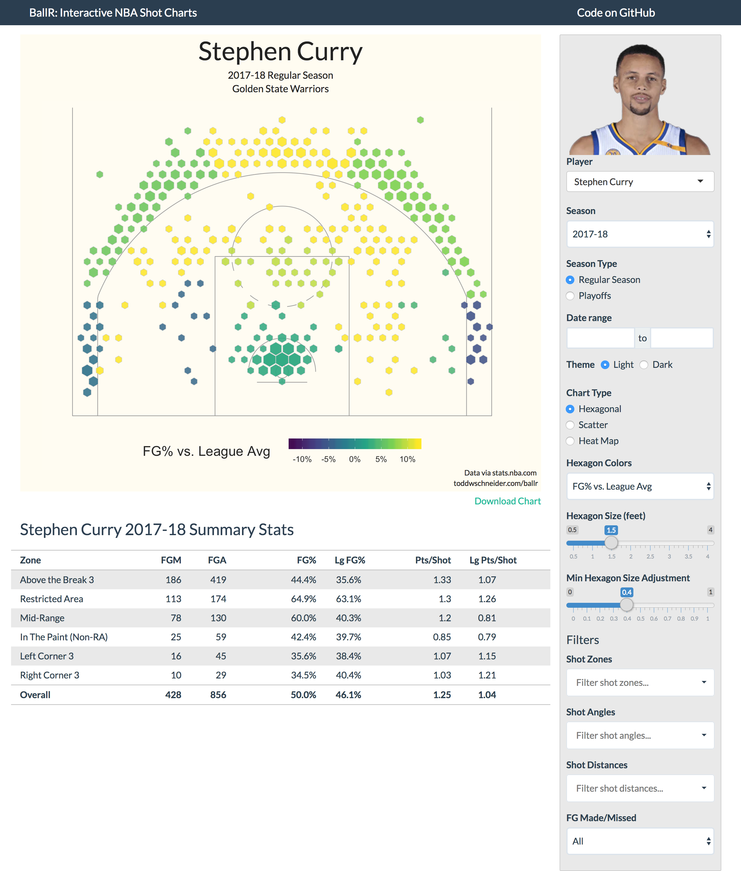
BallR uses the NBA Stats API to visualize every shot taken by a player during an NBA season dating back to 1996.
See also the college branch of this repo for men's college basketball shot charts.
You can run BallR on your own machine by pasting the following code into the R console (you'll have to install R first):
packages = c("shiny", "tidyverse", "hexbin")
install.packages(packages, repos = "https://cran.rstudio.com/")
library(shiny)
runGitHub("ballr", "toddwschneider")There are three chart types to choose from: hexagonal, scatter, and heat map
Hexagonal charts, which are influenced by the work of Kirk Goldsberry at Grantland, use R's hexbin package to bin shots into hexagonal regions. The size and opacity of each hexagon are proportional to the number of shots taken within that region, and the color of each hexagon represents your choice of metric, which can be one of:
- FG% vs. league average
- FG%
- Points per shot
There are two sliders to adjust the maximum hexagon sizes, and also the variability of sizes across hexagons, e.g. here's the same Stephen Curry chart but with larger hexagons, and plotting points per shot as the color metric.
Note that the color metrics are not plotted at the individual hexagon level, but at the court region level, e.g. all hexagons on the left side of the court that are 16-24 feet from the basket will have the same color. If BallR were extended to, say, chart all shots for an entire team, then it might make sense to assign colors at the hexagon-level, but for single players that tends to produce excessive noise.
Scatter charts are the most straightforward option: they show the location of each individual shot, with color-coding for makes and misses
Heat map charts use two-dimensional kernel density estimation to show the distribution of shot attempts across the court.
Anecdotally I've found that heat maps often show, unsurprisingly, that most shot attempts are taken in the restricted area near the basket. It might be more interesting to filter out restricted area shots when generating heat maps, for example here's the heat map of Stephen Curry's shot attempts excluding shots from within the restricted area:
BallR lets you filter shots along a few dimensions (zone, angle, distance, made/missed) by adjusting the inputs in the sidebar. When you apply filters, the shot chart and summary stats update automatically to reflect whatever subset of shots you have chosen.
BallR comes with light and dark color themes, and you can define your own theme in court_themes.R
The data comes directly from the NBA Stats API via the shotchartdetail endpoint. See fetch_shots.R for the API call itself. The player select input lets you choose any player and season back to 1996, so you can compare, for example, Michael Jordan of 1996 to LeBron James of 2012.
NBA Shots DB is a Rails app that populates a PostgreSQL database with every NBA shot attempt since 1996 (4.5 million shots and growing).
https://github.com/toddwschneider/nba-shots-db
BallR does not interact with NBA Shots DB yet, but that might change in the future.
Posts by Savvas Tjortjoglou and Eduardo Maia about making NBA shot charts in Python and R, respectively, served as useful resources
todd@toddwschneider.com, or open a GitHub issue


