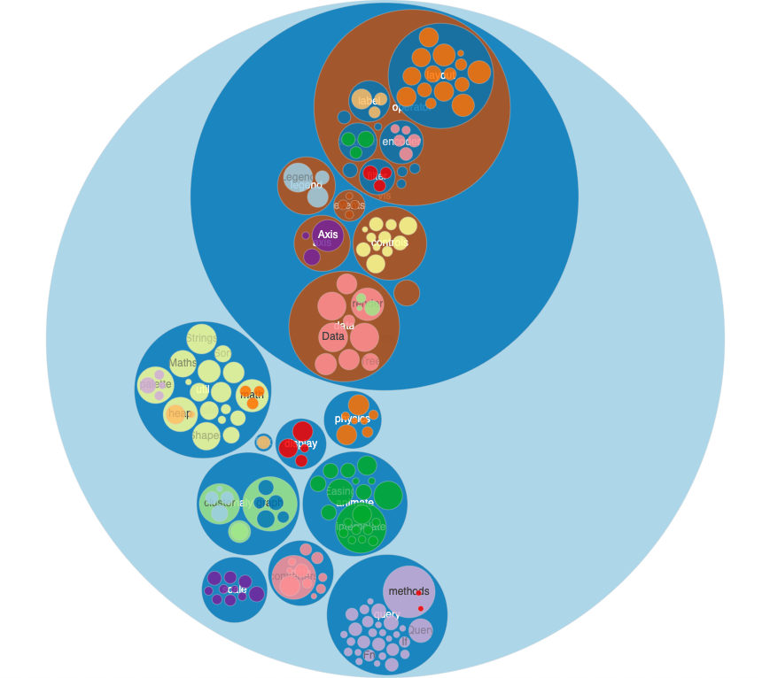
An interactive circle packing chart for visualizing proportions in hierarchical data, where nodes of a tree are represented as nested circles.
Supports zooming interactions via mouse-wheel events or by clicking on a node, which focuses the viewport on the associated sub-tree. Clicking in the chart's background resets the zoom to its initial position. The chart also responds to data changes by animating the dimensions of each of the nodes into their new positions.
For improved performance, circles with radius smaller than a given threshold (minCircleRadius) are excluded from the DOM, allowing for representation of large data sets while maintaining a smooth interaction. See here for an example of a randomly generated large data structure.
See also the Treemap, Icicle and Sunburst charts.
import CirclePack from 'circlepack-chart';or using a script tag
<script src="//unpkg.com/circlepack-chart"></script>then
const myChart = new CirclePack(<myDOMElement>)
.data(<myData>);| Method | Description | Default |
|---|---|---|
| data([object]) | Getter/setter for chart data (see below for syntax details). | |
| width([number]) | Getter/setter for the chart width in px. | <window width> |
| height([number]) | Getter/setter for the chart height in px. | <window height> |
| children([string or fn]) | Getter/setter for a data node's children accessor, used to establish the hierarchical relationship between nodes. Supports either a string indicating the object's property name, or a function(node) which should return an array of nodes. |
children |
| label([string or fn]) | Getter/setter for a node object label accessor, used to display labels on the circles and their tooltips. | name |
| size([string or fn]) | Getter/setter for a node object size accessor, used to compute the areas of the circles. | value |
| padding([number]) | Getter/setter for the amount of padding between adjacent circles, in px. | 4 |
| color([string or fn]) | Getter/setter for a node object color accessor, used to color the circles. | grey |
| borderWidth([number, string or fn]) | Getter/setter for a node object border width accessor, used to set the stroke width of each circle. | 1 |
| nodeClassName([string or fn]) | Getter/setter for a node object classname accessor. Determines the CSS class(es) to apply to each circle node. | |
| minCircleRadius([number]) | Getter/setter for the minimum radius of a circle (in px) required for it to be rendered in the DOM. | 3 |
| excludeRoot([boolean]) | Getter/setter for whether to exclude the root node from the representation. | false |
| sort([fn]) | Getter/setter for the compare method used to sort sibling circles. A value of null (default) maintains the existing order found in the input data structure. This method is equivalent to d3-hierarchy's sort, it receives two arguments representing two sibling nodes and expects a numeric return value (-1, 0 or 1) indicating the order. Each element is an instance of d3-hierarchy node and has several useful properties to specify order: data (the corresponding data object), value (summed value of node and all its descendants) and depth (layer degree). For example, to order circles by size, use: (a, b) => b.value - a.value. |
<existing order> |
| showLabels([boolean]) | Getter/setter for whether to show labels in the nodes. Regardless of this setting, labels too large to fit within a circle's diameter are automatically hidden. | true |
| showTooltip([fn]) | Getter/setter to specify a node object tooltip's visibility. If this function returns false for a particular node, that node's tooltip will not display at all. If unspecified, all nodes' tooltips will display. |
() => true |
| tooltipTitle([fn]) | Getter/setter for a node object tooltip title. The function should return a string to be displayed in bold in the first line of the tooltip. If unspecified, the full hierarchical name will be displayed. | |
| tooltipContent([fn]) | Getter/setter for a node object tooltip content. Use this to specify extra content in each of the circle's tooltips in addition to the title set in tooltipTitle. |
|
| zoomToNode([node]) | Programmatically zoom the chart to a particular node. | |
| zoomBy([number]) | Programmatically zoom the chart by a specific amount. 1 is unity, above one indicates a zoom-in and below a zoom-out. |
|
| zoomReset() | Programmatically reset the zoom to the global view. | |
| onHover([fn]) | Callback function for mouse hover events. The data node object (or null if hovering on background) and the event object are included as arguments onHover(node, event). |
|
| onClick([fn]) | Callback function for click events. The data node object (or null if clicking on the background) and the event object are included as arguments onClick(node, event). A falsy value (default) automatically zooms on clicked circles, equivalent to myChart.onClick(myChart.zoomToNode). |
|
| onRightClick([fn]) | Callback function for right-click events. The data node object (or null if right-clicking on the background) and the event object are included as arguments onRightClick(node, event). A falsy value (default) will fallback to the default browser behaviour, which is to open the context menu. |
|
| transitionDuration([number]) | Getter/setter for the animation duration of transitions between states (opening, zoom in/out) in milliseconds. Enter 0 to disable animations. |
800 |
{
  name: "root",
  children: [
    {
      name: "leafA",
      value: 3
    },
    {
      name: "nodeB",
      children: [
        {
          name: "leafBA",
          value: 5
        },
        {
          name: "leafBB",
          value: 1
        }
      ]
    }
  ]
}


