Welcome to the Finance Data Visualisation Toolkit – a powerful set of tools and resources designed to facilitate comprehensive data visualization in the field of finance. This repository aims to provide a collection of scripts, notebooks, and examples for creating insightful visualizations to aid financial analysis, decision-making, and reporting.
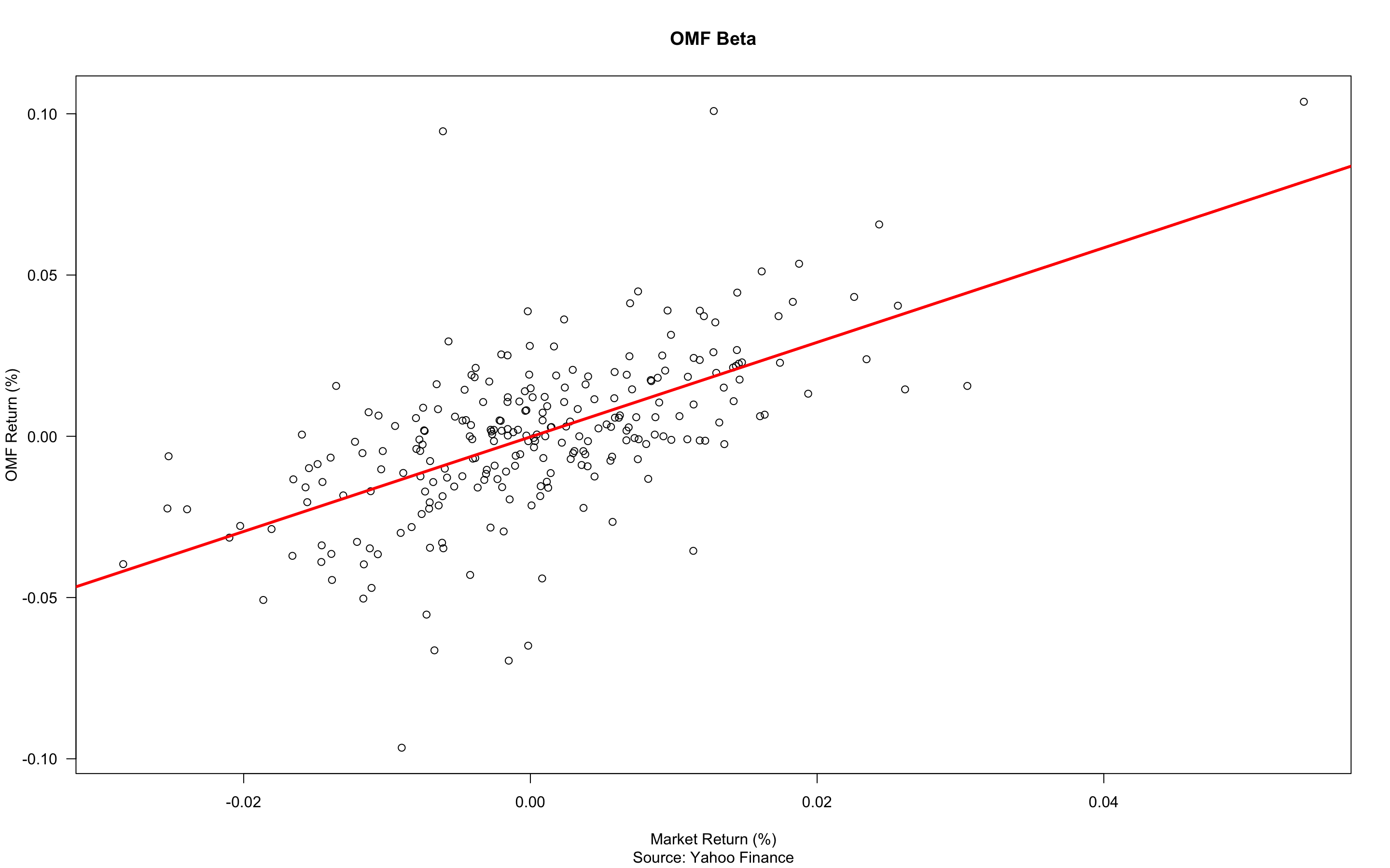
Can be used to visualise Stock's Beta. Beta measures the impact of index values on a single stock. The closer the dots to the line, the more significant the influence of the stock market on the share price.
I have modified the script so now it can be used to plot this kind of scatter plot for more than one column at the time. Therefore, when typing time series dataset, you will get plots for all securities in it.

.png?raw=true)
%20via%20ggplot2.png?raw=true)
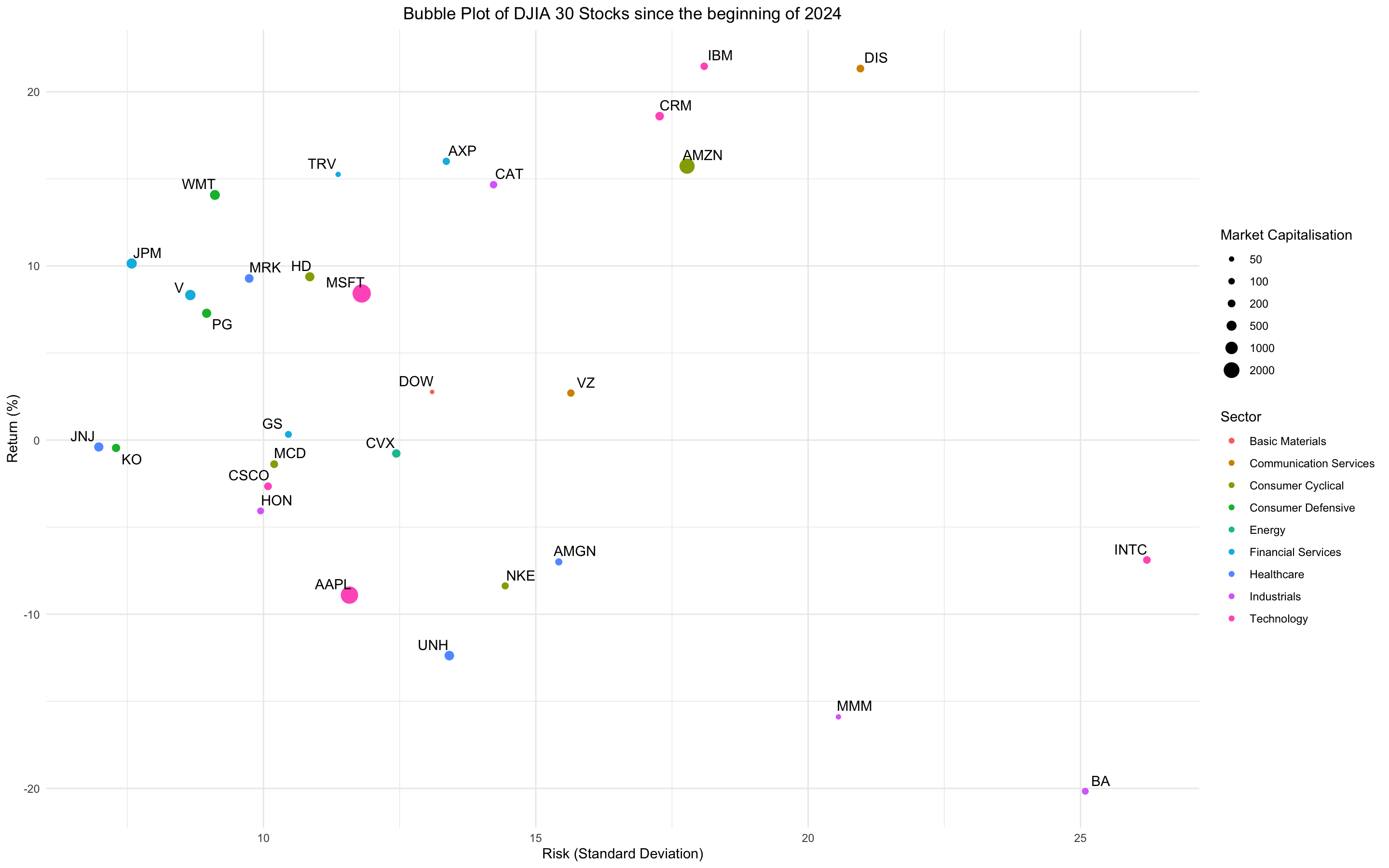
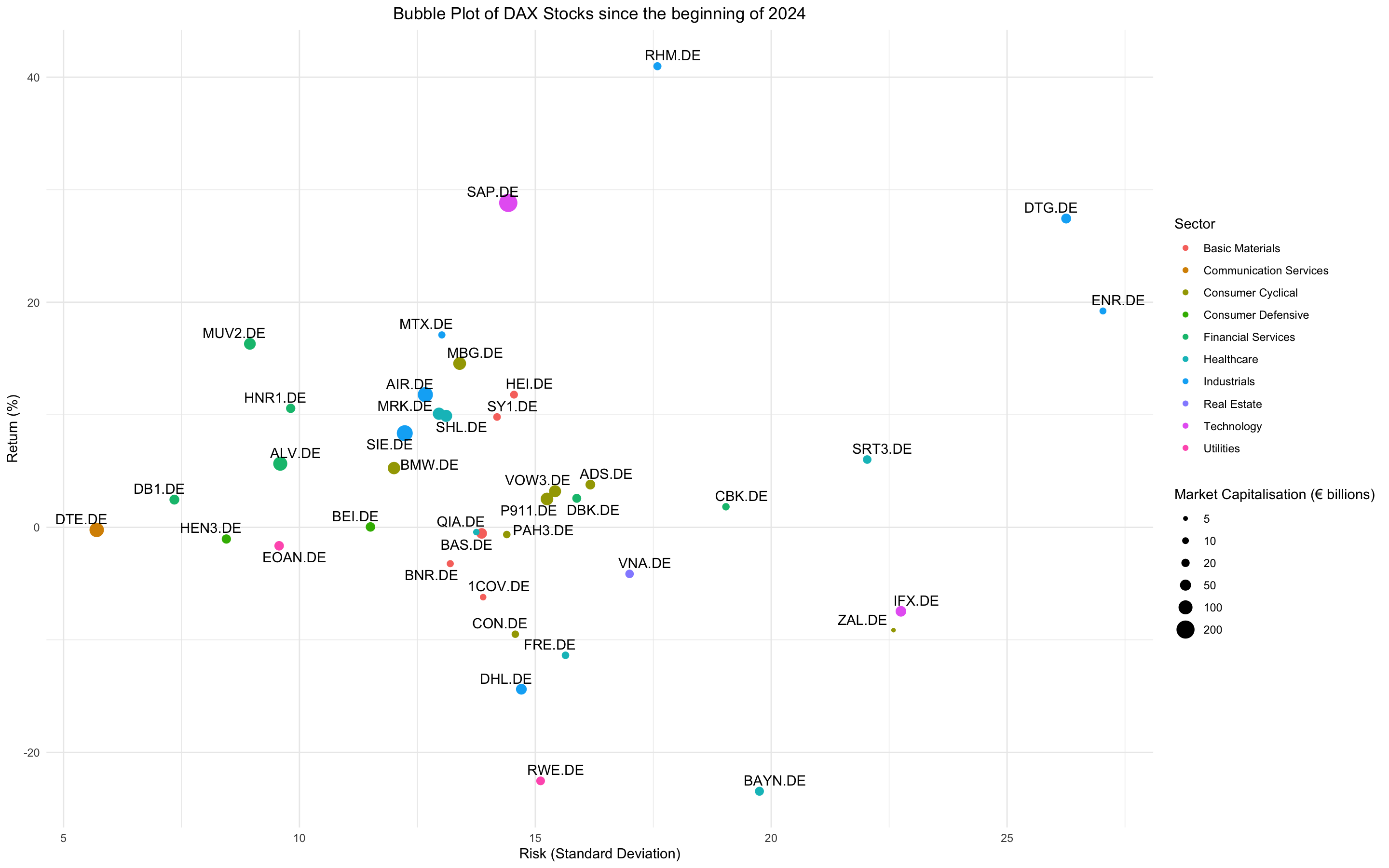
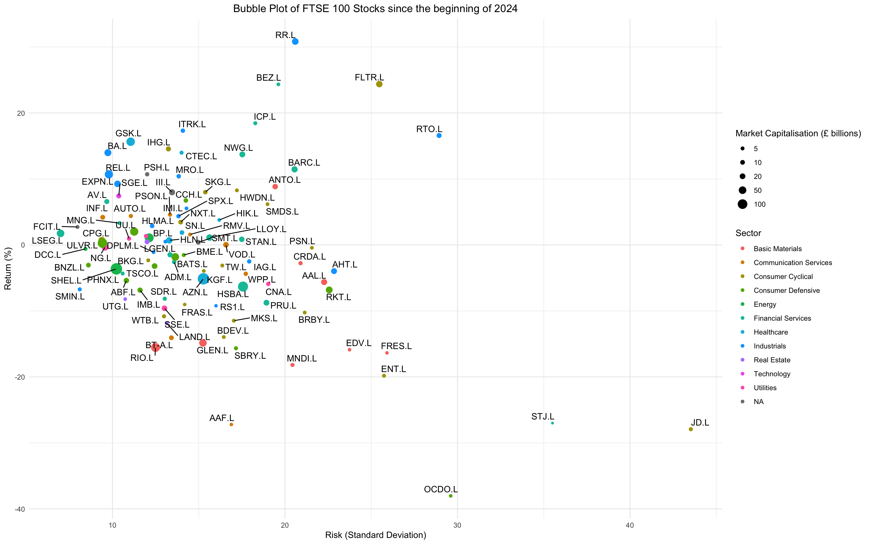
It is an extended version of standard risk and return graph where market capitalisation (cap) and industry infos are incorporated into graph. Market Cap is represented by the size of the dot or bubble (the higher the cap, the bigger the bubble), whereas the industry is showed by the colour of the bubble. The application was inspired by TED lectures and "Factfulness" of Swedish statistician Hans Rosling.
- My R Script: https://github.com/vladislavpyatnitskiy/financial.data.visualisation/blob/main/Scatter%20Plot/Risk%20and%20Return%20Bubble%20Plot.R
- Library: ggplot2, ggrepel, quantmod, timeSeries, rvest
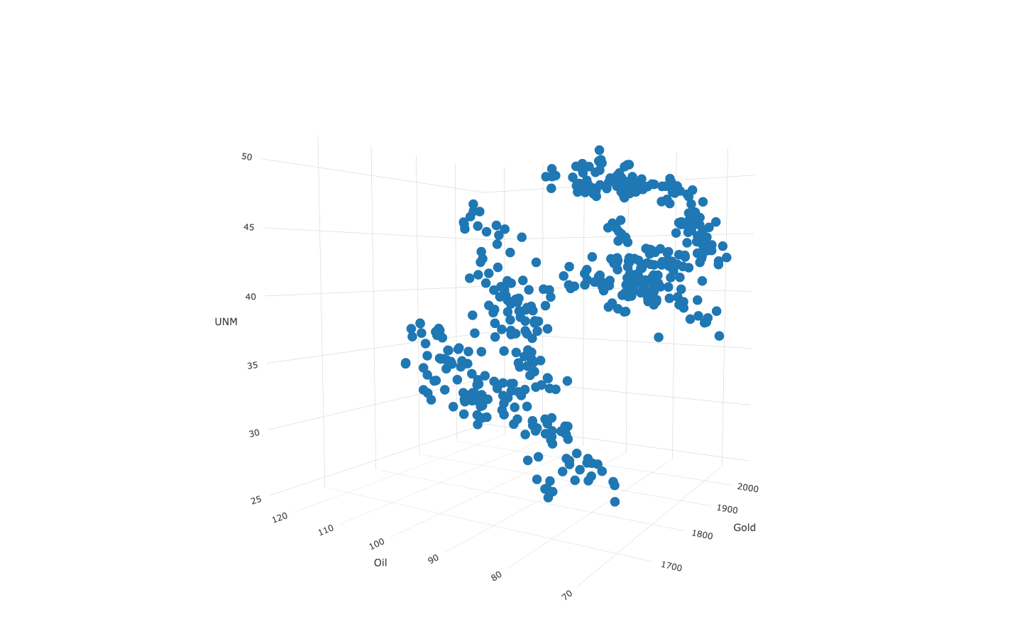
3D version of a Scatter Plot where it is possible to visually evaluate the impact of 2 factors on the security.
-
R Libraries: Plotly, quantmod
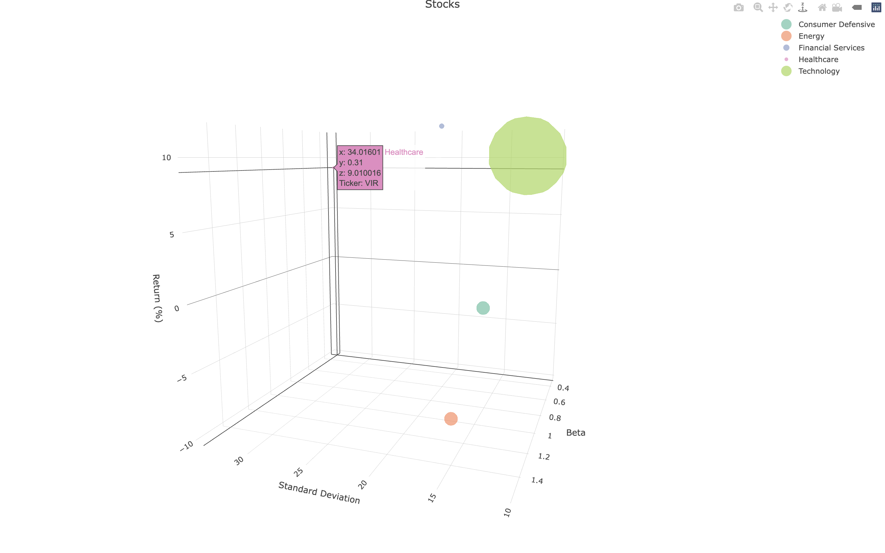
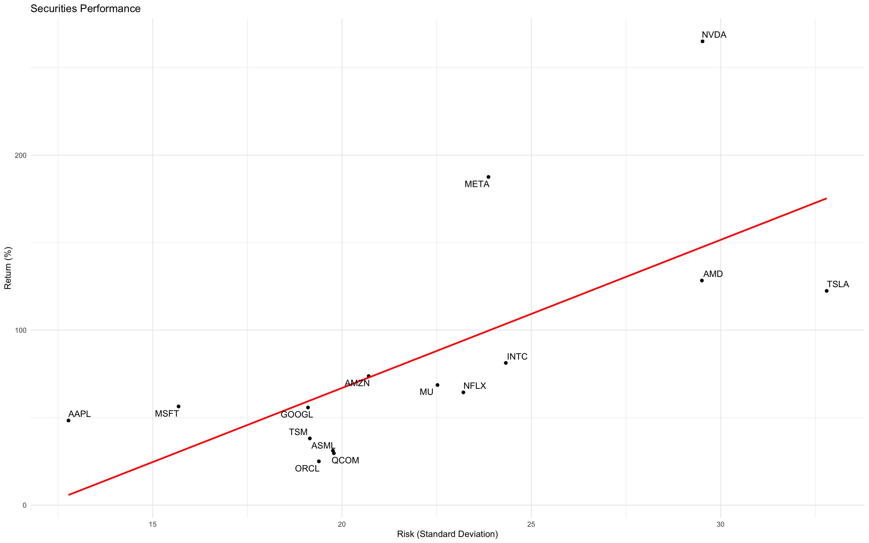
Standard Scatter Plot is frequently used to visualise risk and return of securities, where risk is represented either by standard deviation or beta. Therefore, I think it is interesting solution to combine both of these risk metrics to see a whole picture. As standard deviation is a measure of total risk and beta of systematic risk, investor might find new insights for portfolio.
-
R Libraries: Plotly, Tidyverse, quantmod
-
Python Libraries: plotly.express as px
- Default R code:
plot()
• My R script: https://github.com/vladislavpyatnitskiy/Data-Visualisation-for-finance-in-R/blob/main/Line%20Plot/Plot.R

Script is an extension of function of quantmod library, which enables to visualise 50 and 200 days moving average together with main line plot.
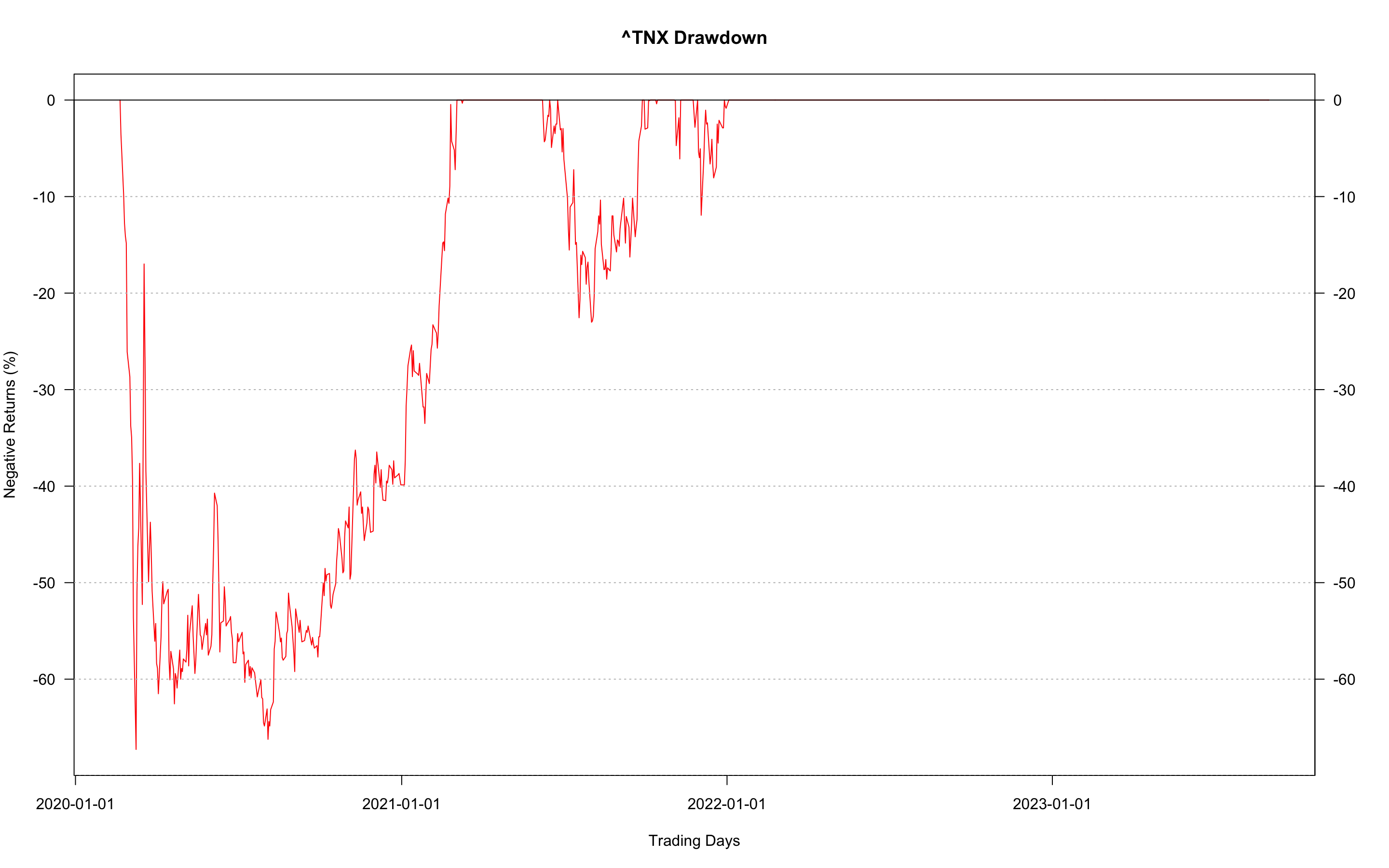
Used to concentrate on asset price/return decrease. It shows either prices lower than specified or negative return values so troughs are clearly seen.
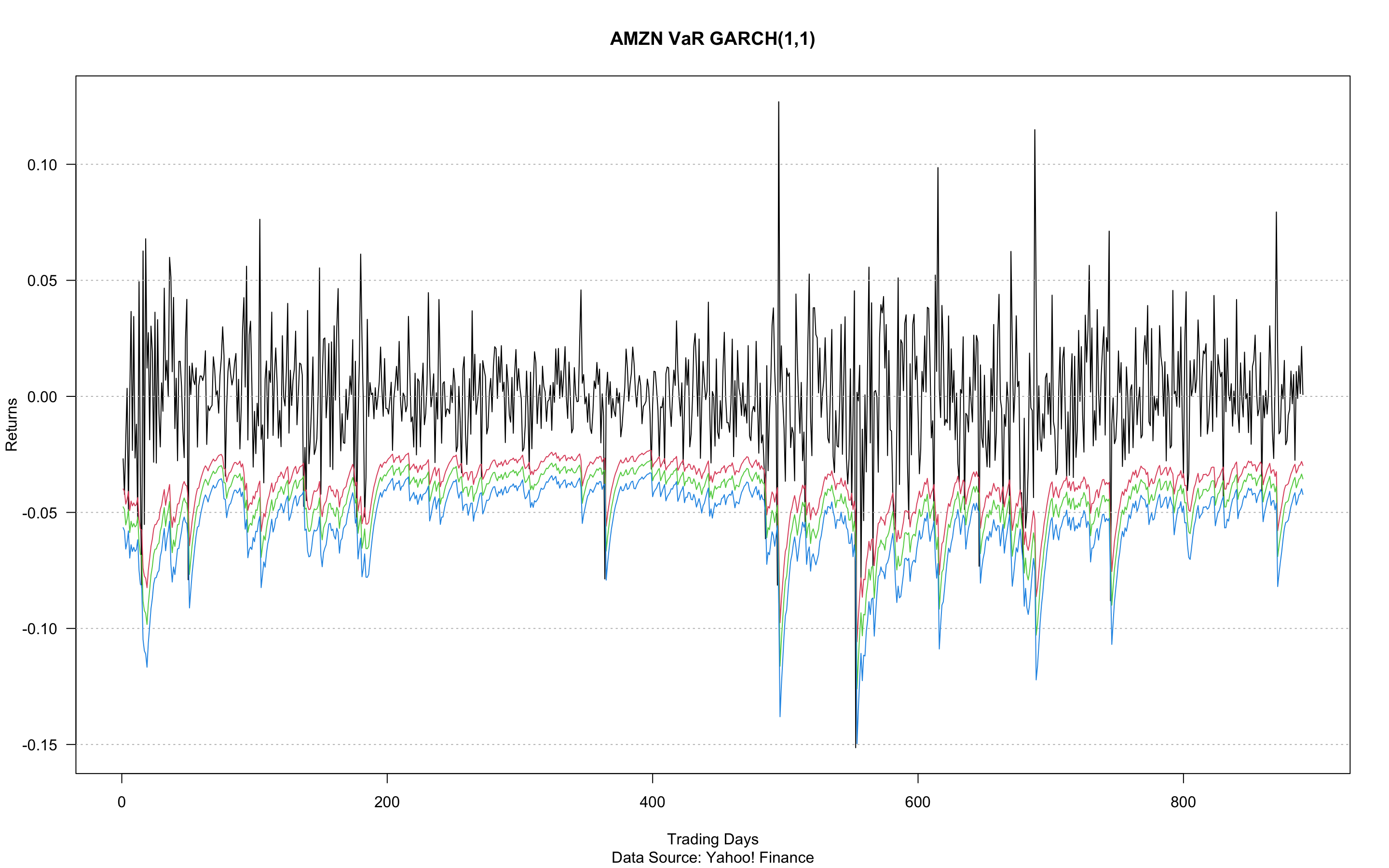
It is also possible to visualise returns via line plot. It shows volatility of the security and might be applied to compare two securities. In addition other parameters can be shown, for example, VaR for long positions.
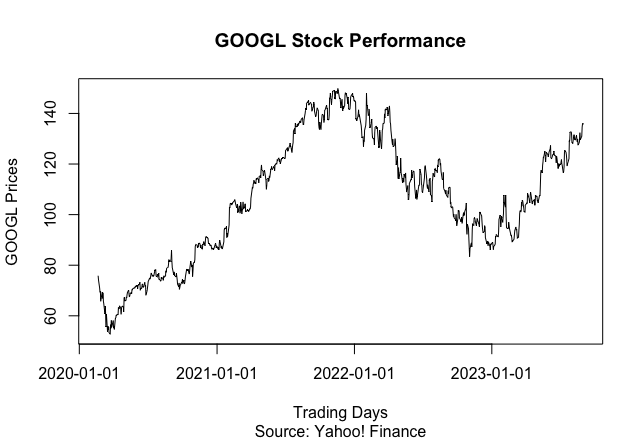
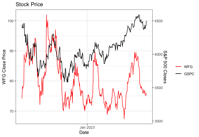
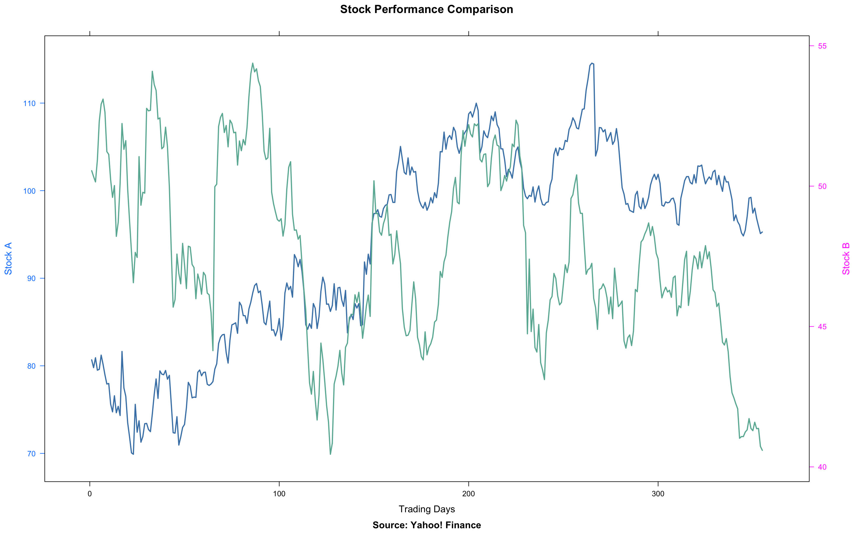
This chart is suitable for the comparison of two tickers. For example, comparison of stock and its index or commodity it relies on. It would not be suitable for comparison of several securities where Multiple Line Plot suits much better.
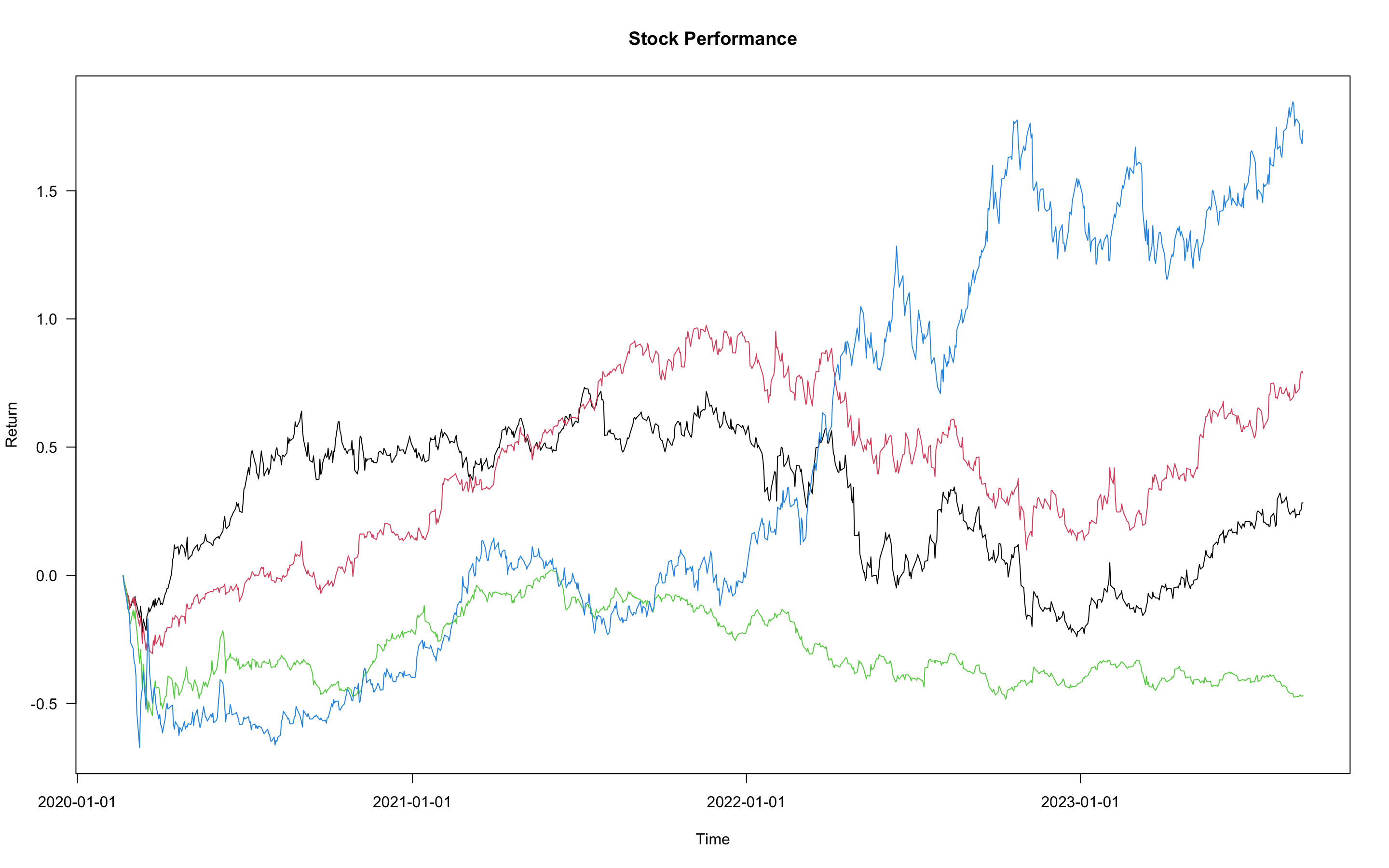
This plot is the best when comparing performance of more than two securities, as it shows real value changes for time. It enables to evaluate industry peer performance and indicate winners and outsiders of current market conditions.
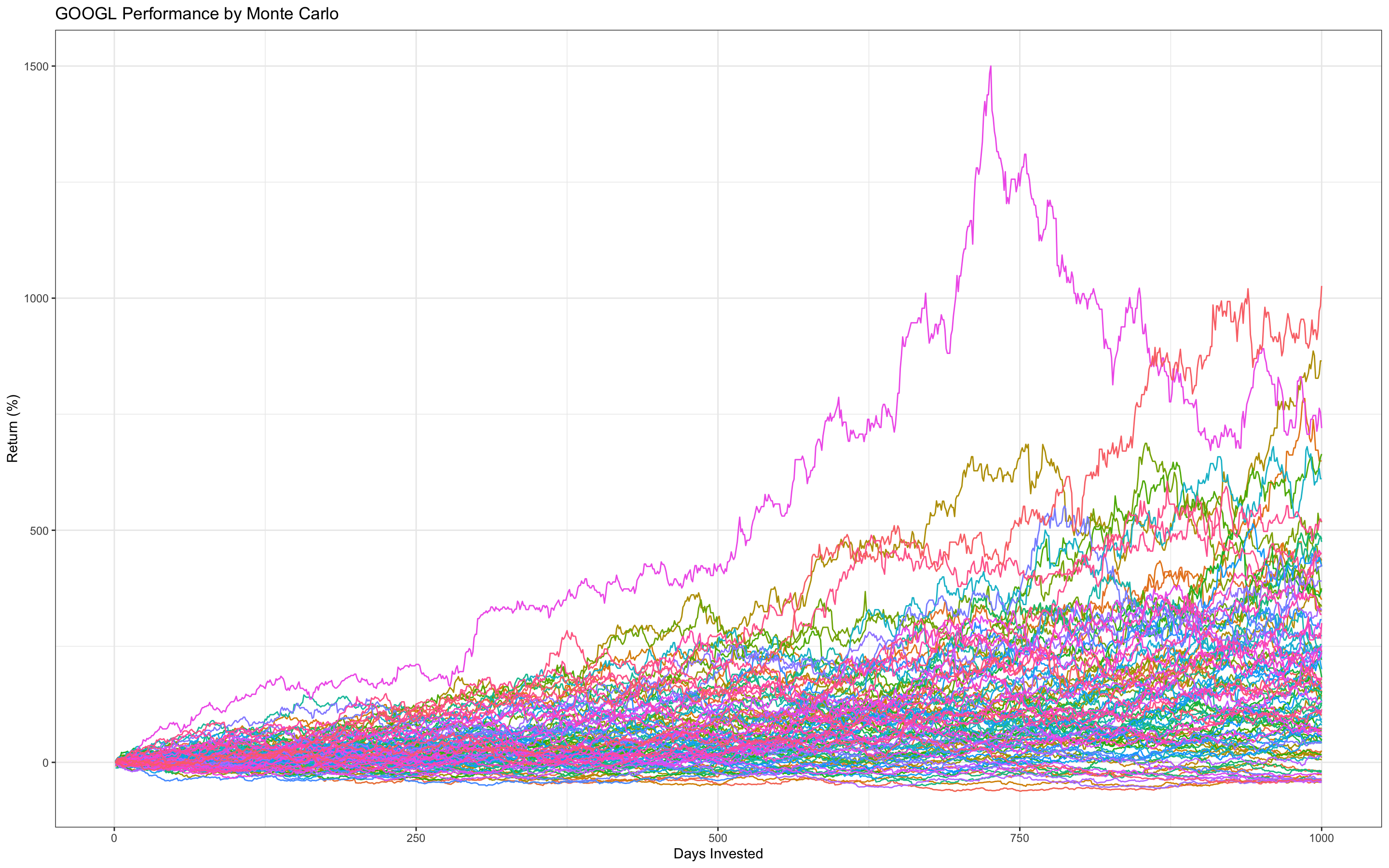
Another possible option for application is visualisation of Monte Carlo Simulation which is based on both stochastic processes and previous security dynamics.
- My R script: https://github.com/vladislavpyatnitskiy/Risk-Management-Analytics/blob/main/Monte%20Carlo%20Method.R
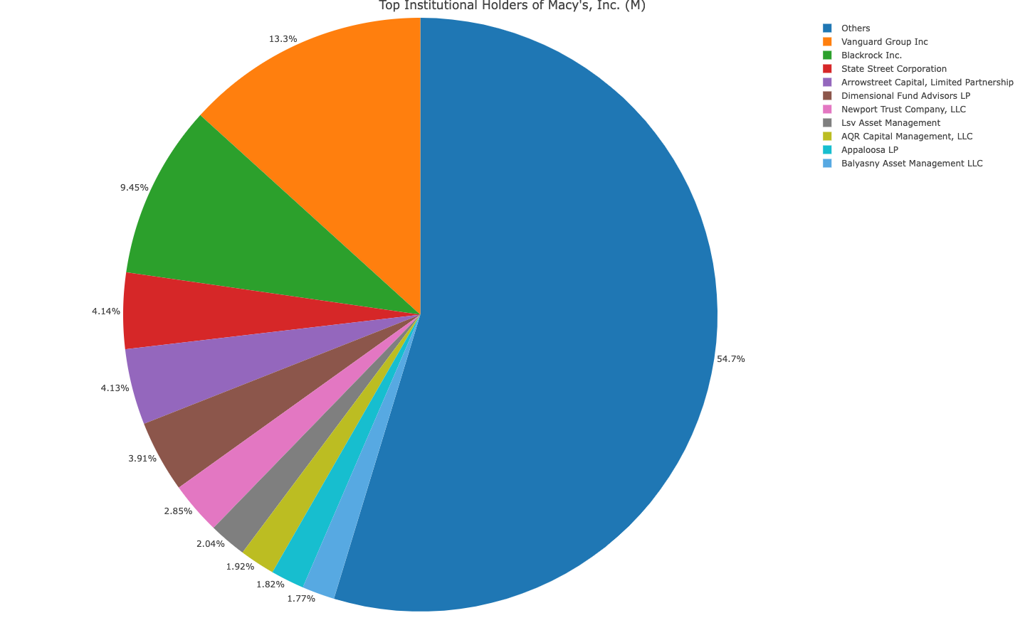
This kind of plot can be utilised to show Major Institutional Holders of companies
It can be used for portfolio assessment.
fBasics Histogram
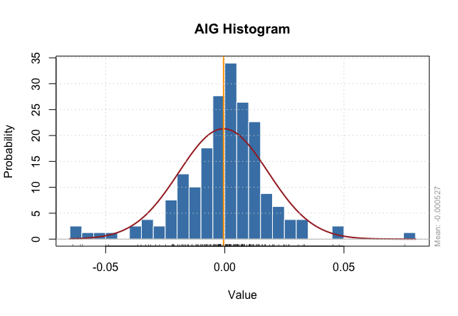
My Script Histogram

It shows distribution of stock return what can tell about past performance. For example, negatively skewed distribution demonstrates recent strong negative returns as well positively skewed distribution with positive returns. If you are a contrarian investor who prefers stocks that recently dropped, you should look for ones with negatively skewed distributions. Momentum investors would prefer positively skewed distributions as they select stocks that have been performing good recently hoping that growth will continue. Red line represents normal distribution enabling to evaluate approximate properties of generated histogram.
- Default R script :
hist() - fBasics R script:
histPlot() - My R script: https://github.com/vladislavpyatnitskiy/Data-Visualisation-for-finance-in-R/blob/main/Histogram/Own%20Hist%20Script.R
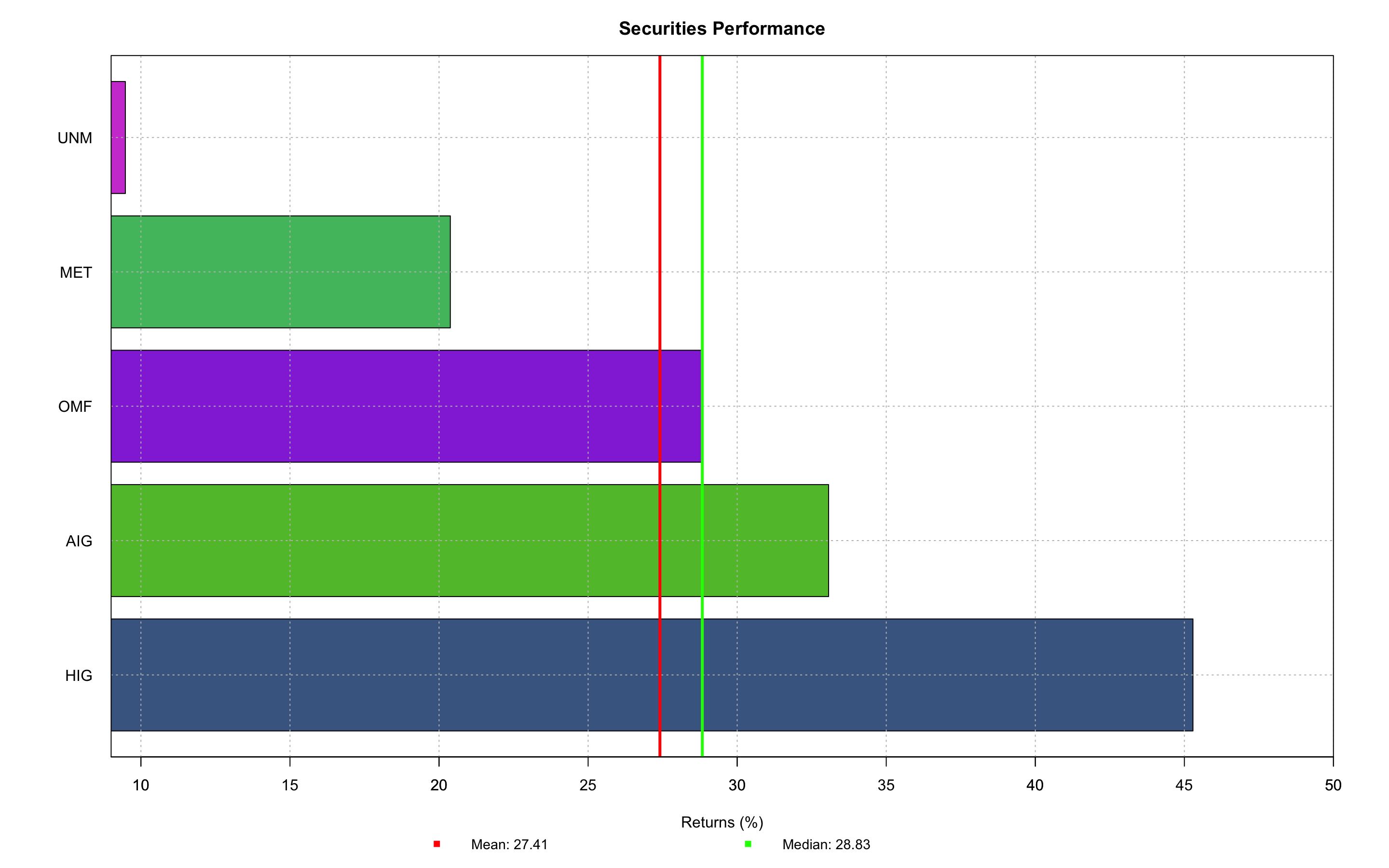
It demonstrates the change in stocks' returns for the certain periods of time and enables to compare their performance. The default script does not sort parameters both ascending and descending correctly so some improvements have been completed to make script flawless.
- Default R Code:
barplot() - My R Code: https://github.com/vladislavpyatnitskiy/Data-Visualisation-for-finance-in-R/blob/main/barplot/Bar_Plot.R
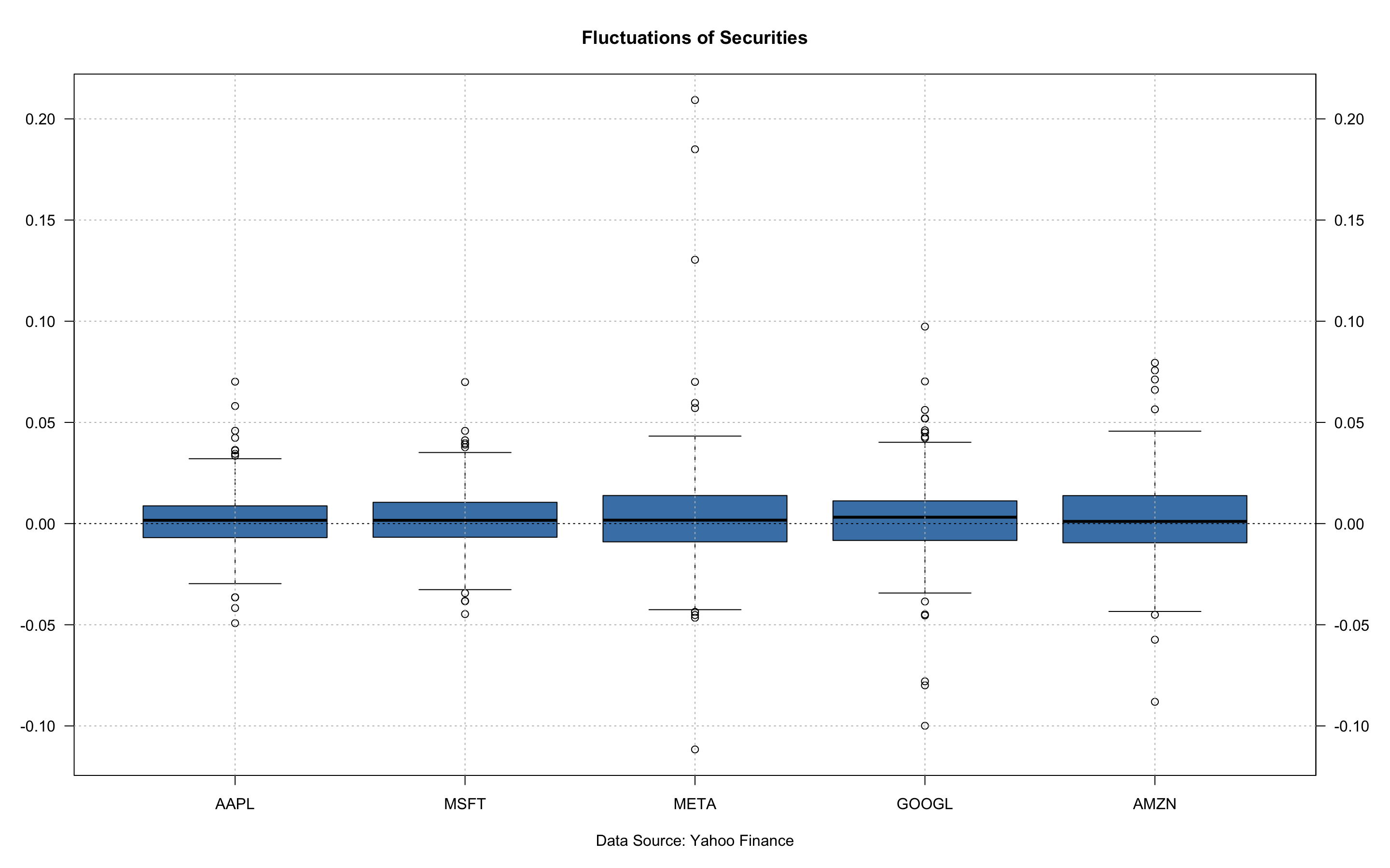
This one is similar to barplot but focused on volatility of several securities and enable to identify outliers in data. In default and fBasics scripts finance data should be extracted and cleaned prior plotting, while I modified it in a way it is only required to type tickers, time period and title inside a function. Therefore, plot process is more convenient especially if it is a frequent activity.
- Default R Code:
boxplot() - fBasics R Code:
boxPlot() - My R Script: https://github.com/vladislavpyatnitskiy/Data-Visualisation-for-finance-in-R/blob/main/Boxplot/Boxplot.R
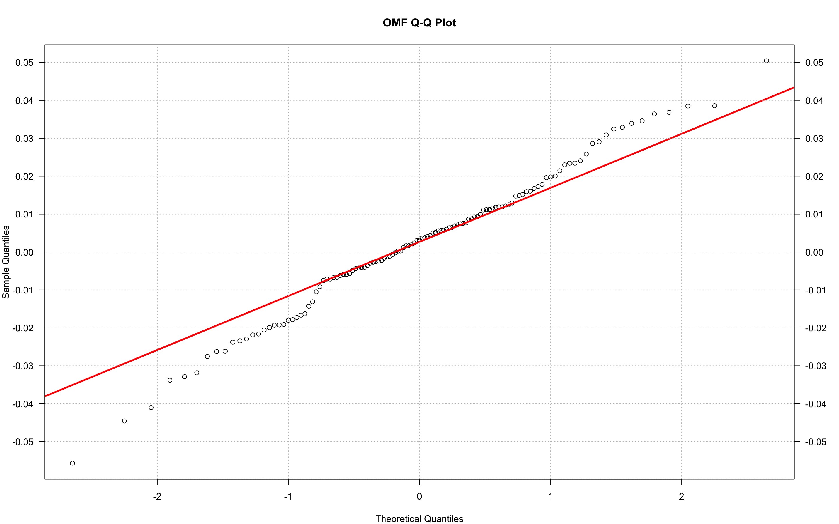
Plot is a visualised evidence whether security's distribution is normally distributed or not (sort of visual version of Shapiro or Jarque Bera tests). In first case it should perfectly lie on a red line. When ends of the distribution line moving away from a general line proves data is not normally distributed.
- Default R Code:
qqnorm(lrtn) qqline(lrtn, col = "red") - My R code: https://github.com/vladislavpyatnitskiy/Data-Visualisation-for-finance-in-R/blob/main/QQ%20Plot/QQ%20plot.R
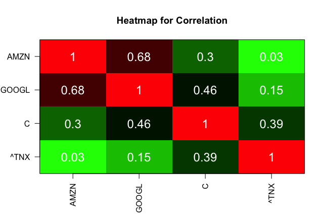
Visualised version of correlation table. Feature of the heatmap as it makes more clear for audience to see weak and strong correlations between certain things. For this particular example, weak correlation is positive sign as it is an indicator to add weakly correlated pairs to portfolio because security may decrease unsystematic risk.
- My R script: https://github.com/vladislavpyatnitskiy/Data-Visualisation-for-finance-in-R/blob/main/Heatmap/Heatmap%20script.R
Yahoo! Finance API
- ggplot2
- broom
- tidyr
- ggrepel
- dplyr
- Plotly
- quantmod
- PortfolioAnalytics
- timeSeries
- fBasics
- rvest