-
Notifications
You must be signed in to change notification settings - Fork 880
ToggleSwitch
DianeXceed edited this page Jun 19, 2017
·
2 revisions
Only available in the Plus Edition
Derives from Control
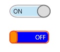
The ToggleSwitch control is a fully customizable on/off switch that can be used to enhance the UI experience.

| Property | Description |
|---|---|
| IsChecked | Gets or sets if the ToggleSwitch is currently checked. |
| IsCheckedLeft | Gets or sets if the Checked value is on the Left side. |
| CornerRadius | Gets or sets the radius of the corner of the toggleSwitch |
| OuterMargin | Gets or sets the OuterMargin of the ToggleSwitch. |
| InnerMargin | Gets or sets the InnerMargin of the ToggleSwitch. |
| CheckedContent | Gets or sets the Checked Content. |
| CheckedTooltip | Gets or sets the Checked ToolTip. |
| CheckedForeground | Gets or sets the Brush for the Foreground of the Checked content. |
| CheckedBackground | Gets or sets the Brush for the Background of the Checked content. |
| UncheckedContent | Gets or sets the Unchecked Content. |
| UncheckedTooltip | Gets or sets the Unchecked ToolTip. |
| UncheckedForeground | Gets or sets the Brush for the Foreground of the Unchecked content. |
| UncheckedBackground | Gets or sets the Brush for the Background of the Unchecked content. |
| ThumbHeight | Gets or sets the Height of the Thumb. A value of 0 will set the Thumb's height to ToggleSwitch.ActualHeight. Default is 0. |
| ThumbWidth | Gets or sets the Width of the Thumb. |
| ThumbElasticity | Gets or sets the Elasticity of the Thumb. |
| ThumbLeftContent | Gets or sets the Thumb's Content Left side. |
| ThumbRightContent | Gets or sets the Thumb's Content Right side. |
| ThumbForeground | Gets or sets the Brush for the Foreground of the Thumb. |
| ThumbBackground | Gets or sets the Brush for the Background of the Thumb. |
| ThumbBorderBrush | Gets or sets the Brush for the Border of the Thumb. |
| ThumbBorderThickness | Gets or sets the BorderThickness of the Thumb. |
| ThumbHoverBackground | Gets or sets the Brush for the Background of the Thumb Hover. |
| ThumbHoverBorderBrush | Gets or sets the Brush for the BorderBrush of the Thumb Hover. |
| ThumbPressedBackground | Gets or sets the Brush for the Background of the Thumb Pressed. |
| ThumbPressedBorderBackground | Gets or sets the Brush for the BorderBrush of the Thumb Pressed. |
| ThumbStyle | Gets or sets the style to use for the thumb in the ToggleSwitch. When this property is null, the following properties will be used in the ToggleSwitch: ThumbLeftContent, ThumbRightContent, ThumbForeground, ThumbBackground, ThumbBorderBrush, ThumbBorderThickness, ThumbHoverBackground, ThumbHoverBorderBrush, ThumbPressedBackground, ThumbPressedBorderBrush. If this property is not null, these properties won’t be used. Default is null. |
| Event | Description |
|---|---|
| IsCheckedValue | Raised when the IsChecked property changes |
| IsCheckedLeftValue | Raised when the IsCheckedLeft property changes |