全局message toast 消息提示 自定义扩展强,默认icon为uni官方icon(如需添加其他icon可自行扩展)
####man.js
import Vue from 'vue'
import App from './App'

import message from '@/components/quick-message/quick-message.vue'
Vue.component('quick-message',message);{
"easycom": {
"^quick-(.*)": "@/components/quick-$1/quick-$1.vue"
},
"pages": [...],
...
}2种引入方式任选一种都可以
<template>
<view>
<view @click="showMessage">show</view>
<!-- 全局message组件 -->
<quick-message ref="message"></quick-message>
</view>
</template>
<script>
export default {
data() {
return {
...
}
},
methods:{
showMessage(){ //显示message
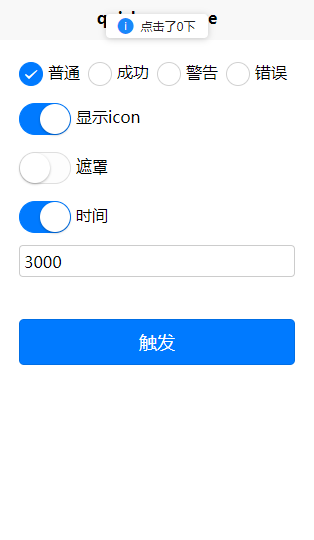
this.$refs.message.show({
type:'default', //String 默认default
msg:'点击了消息提示窗', //String 显示内容 *
direction:'top', //String 默认顶部显示
icon:true, //Boolean|String 显示icon(false/true/string 默认显示icon)
mask:true, //Boolean 遮罩(默认false没有遮罩)
time:5000, //Number|Boolean 默认3000/false为不自动关闭
customStyle:{ //自定义样式
color:'#FFFFFF', //字体图标色
backgroundColor:'rgba(0,0,0,.5)' //背景色
},
iconSize: 16, //Number 自定义icon大小(单位px 默认16 设置后会覆盖自定义样式里的设置优先级最高)
iconColor: '', //String icon颜色(默认主题颜色 设置后会覆盖自定义样式里的设置优先级最高)
})
}
}
}
</script>
...如果想扩展icon可在icon处输入icon name 支持uni官方icon 官方icon链接:https://uniapp.dcloud.io/component/icon
    this.$refs.message.show({
		 msg:'点击了0下'
})| parameter | type | default value | example | description |
|---|---|---|---|---|
| type | string | default | default/success/warning/error | 消息提示类型 |
| msg | string | 提示消息 | ||
| direction | string | top | top/center/bottom | 显示方向 |
| icon | boolean/string | true | true/fasle/success/info/... | 消息提示icon详情参见https://uniapp.dcloud.io/component/icon 默认为true根据消息类型系统默认icon |
| mask | boolean | false | true/false | 消息提示遮罩,打开后需要等上一个消息关闭后才能继续点击或其他事件行为 |
| time | boolean/number | 3000 | true/fasle/number | 消息提示时间 true为默认3000毫秒,false为关闭时间 (单位毫秒) |
| customStyle | object | {} | {...} | 自定义样式,可根据自己需求进行样式改变,(注意这里的fontSize(单位rpx),和color也会改变icon的大小及颜色,如果你需要icon自定义可以配置iconSize和iconColor进行单独设置) |
| iconSize | number | 16 | number | icon大小 (优先级最高 单位px) |
| iconColor | string | 默认为消息提示类型主题色 | string | icon颜色 (优先级最高) |