-
Notifications
You must be signed in to change notification settings - Fork 1
Illustrations
DECD has an account with Freepik to access stock illustrations. Please contact Sidra Mahmood to access the premium content.
Additionally, the following libraries provide more inclusive illustration sets with free, creative commons licenses:
Start by checking out the general pattern for images and style guidance from the Canada.ca design system.
Illustrations Over Images
In many instances, Illustrations should be used over images in certain circumstances:
- When looking to provide visual context/tell a story
- To add a personal feel to your images
- Data representation (charts/graphs)
There are also certain cases, where it is not advisable to use illustrations:
- Authenticity
- Endorsement
1. Visual Context
An illustration can be used for Storytelling or to provide context. At times words will not be enough to provide context for what you need to pass on to the user, and an image may not be readily available or will have to be heavily modified. Instead an illustration will help in conveying the whole context.
Multicultural people standing together illustration created by pch.vector - www.freepik.com
This illustration shows many people of various interests from various backgrounds. This specific illustration conveys that what we are doing is for all. The illustration is also able to convey the mood or feelings of the individual as well to the viewer as noted by the little symbols (sunshine, music note, heart etc) above the illustrated people.
2. Personal Feel
Illustrations work well if you want to convey a sense of uniqueness or brand to the user. This could include characters, colours, designs that could be associated to your brand that would otherwise be difficult to find in a specific image.
Branding illustration created by Freepix - www.freepik.com
This illustration is for a stationary brand called Simple. From the illustration this brand focuses on gray/greens and browns (earthy tones) for it's colours. It also shows many screens meaning that this brand's app can be accessed from multiple devices at once. This Illustration has more of a real feel to help sell the stationary
3. Graphs and Charts
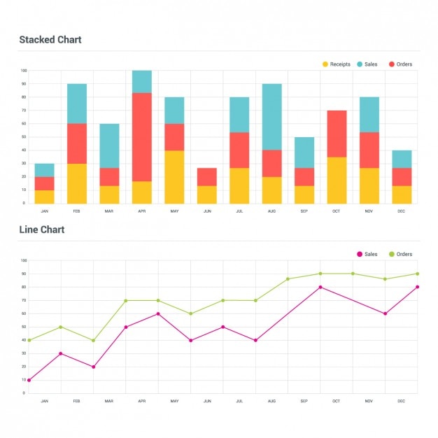
Illustrations are used for charts and graphs to depict the data you are representing.
Branding illustration created by Ibrandify - www.freepik.com
The above charts are two examples of data depicting money spent over the year and where it was spent. This helps identify to the user that this person/company's spending habits over the year.
1. Authenticity and Endorsement
If the goal is to look authentic and/or to endorse a product, then an illustration may not be the best choice. If you are trying to sell a sports drink. A character of an athlete enjoying your sports drink will have less impact than a photo of the real life athlete enjoying your sports drink.
Drinking photo created by marymarkevich - www.freepik.com
Drinking illustration created by syarifahbit- www.freepik.com
Although both of these images have people drinking, the first one conveys a sense of authenticity and endorsement for the drink that the woman is holding. This is because one can relate to the realism of the photo. The second one, although does provide two people drinking, does not convey the same level of realism or endorsement. If the goal is to tell a story that the people are drinking then the second one works well. If the goal is to sell the water bottle or the drink, then the first image would work better for the product.
Here are some best practices when selecting or creating illustrations:
1. Reusable Assets
It is a good practice to make or use reusable assets especially if you intend that there will many illustrations that you will be using over your site. This will allow the building of a library so that as you have/create more illustrations, they are easier to maintain or create new ones based on the assets you have.
2. Colours
There are some best practices for how to use colours in illustrations
- 2-4 (max) colours used
- If using complementary colours, ensure that they are not jarring to the eye (contrast ratios)
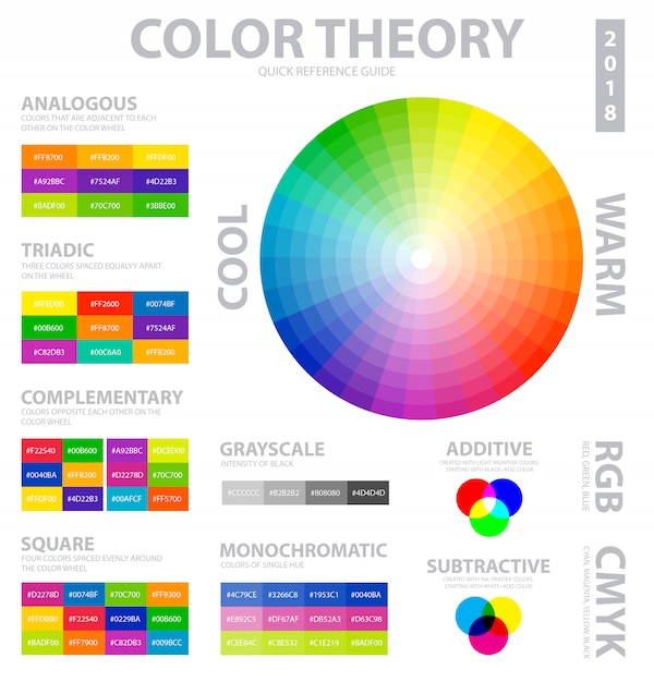
- Stick to analogus colours if possible (colours next to each other on the colour wheel)
- Using complimentary and analogus colours in the same illustration can add with detail/depth
- Uses hues within a colour instead of resorting to different colours automatically
Colour wheel vectors created by macrovector- www.freepik.com
3. Charts and Graphs
Colours
- Use different colours to convey different data items (not just shades of the same colour)
- Use high contrasts colours
- Use text and labels to identify elements
Fonts
- Avoid display fonts
- Stick to serif fonts
- Place labels in easy to read manners
Axis
- Use regular intervals
- Use separate charts if there's a wide range for data points
Ensure that colours (mentioned above), fonts and aspects of the illustration meet the accessibility requirements set. Illustrations should have valid colour contrasts, colour combinations and font sizes at a minimum. Your message may not be conveyed if your illustrations are for more than decoration and are not consumable by some of the users.
We augmented the Canada.ca Design System and Style Guide with best practices for illustrations, and a list of libraries to find stock illustrations.


