-
Notifications
You must be signed in to change notification settings - Fork 43
High level Components
Gökhan Kurt edited this page Apr 4, 2020
·
4 revisions
Page under construction
React is a component based framework. By combining and composition, high-level components can be created from primitive components.
This page shows some built-in high-level components that you can take advantage of.
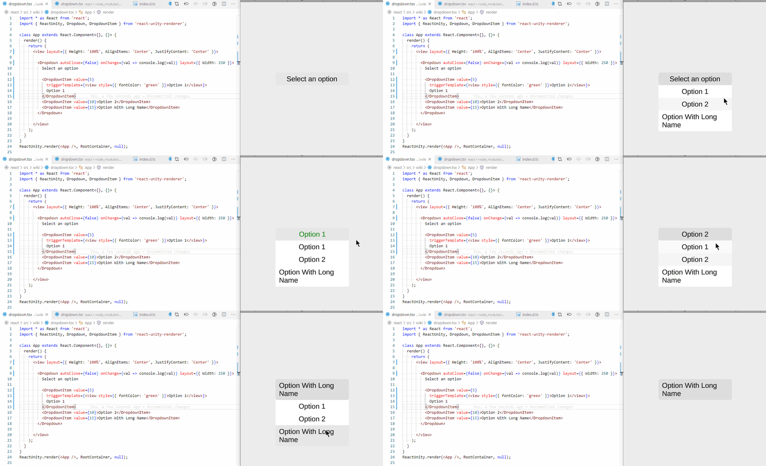
Dropdown is used to show a dropdown component with multiple options to choose from.
It supports all properties of a regular view and additional properties:
-
value: Initial value -
autoClose: Whether to close the dropdown after a value is selected -
onChange: Callback for when the value has changed

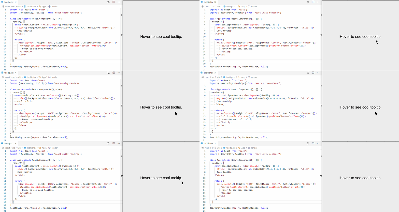
Tooltip shows a popup when hovering over the element.
It supports all properties of a regular view and additional properties:
-
tooltipContent: Content to show when hovering over the element -
position: Position of the tooltip. One ofleft,right,toporbottom -
offset: Distance of the tooltip from the view
