-
Notifications
You must be signed in to change notification settings - Fork 19
As an applicant entering numerical data, I'd like to see a field that implies no text should or can be entered so that I don't have to think about it. #1213
Comments
|
@aQuib - Per the mockup here for 1213, I'm supposed to make the labels of this section bold. However, I do not see that format throughout the rest of the application. I'm including a screenshot below to show the contrast between the change I've made and the rest of the application's labels. Do we want these labels to be bold and if so I'm wondering if I need to make a new card to convert all labels to a bold font-weight. |
|
@Dmac26 - Sorry for the slow response. Yes, please keep it consistent with the overall application (unbolded). |
|
@aQuib - No biggie. Thank you! Will do. |
|
@aQuib and @Dmac26 -- originally the font across the application for this was bold. At some point we veered off the PR process and unfortunately this change slipped in. @aQuib if you as the designer prefer it without bold, then no problem we can definitely keep it this way. But if your intention was to keep it uniform with the application, that's exactly why I raised the concern in your PR @Dmac26. @Dmac26 if you roll back the code car enough you can see for yourself how it used to look. Unless I'm mistaken and at some point this change was a deliberate design choice, we should indeed restore them to bold. For reference, here is a gif showing how it looked back in early December when we added the asterisk for required fields: |
|
@briandavidson - That would make sense to restore this to bold unless Aquib prefers things as they are now. Would you advise we just restore that feature here on 1213 or open a new card? |
@Dmac26 I'm thinking a new issue altogether to keep the scope of this one in tact. |
|
@Dmac26 @briandavidson - Yes, please keep it consistent with the overall application. Please revert back to December styling. The labels are to be bolded. |


Connected to PR #1276
Notes
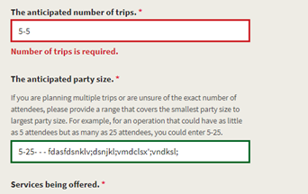
In both applications fields that ask for a numerical response (i.e., number of participants, number of trips, etc.) are long rectangular boxes that indicate text may be accepted. Fields do not have consistent validations wihtin the same application (ex: TOG anticipated number of trips and anticipated party size -see screen shot).
However upon entering information the applicant finds out that only numerical entries are accepted, or that they can enter text information. The field should match the data expectation, and hint text should be offered.
Fields that ask for numerical data only should be sized appropriately, similar to how the calendar fields are set up.
The fields that as for numerical data should also accept special characters such as "-" or "/" so that applicants can enter ranges of data.
TOG application different requirements for similar information:

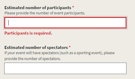
NCGU application field only accepts numbers, but no hint text is describing that

Acceptance Criteria
Tasks
Definition of Done
The text was updated successfully, but these errors were encountered: