Add an alternative block appender when the container doesn't support the default block #10136
Conversation
…the default bloock
|
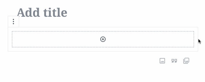
I love it. GIF:
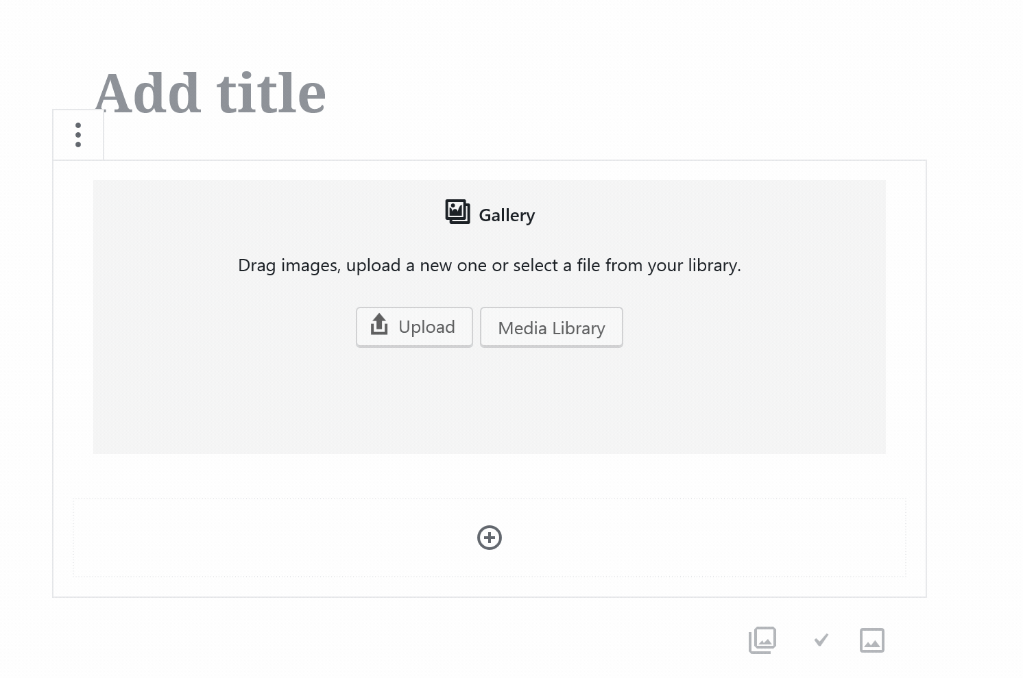
Can you make it so it has a dashed outline like https://user-images.githubusercontent.com/1204802/44717667-f4f46b80-aabd-11e8-890d-d86f19cf3cea.png? That sort of implies where the boundaries of the inserter block will be. Also, can you make it so the entire block is clickable? Sort of like how it is in the gallery?
Nice work! 👍 👍 |

|
I love this! I'd also kill for filters…
Overall, awesome and super excited for this. |
There was a problem hiding this comment.
I noticed that I can still insert the default block even though it's not listed as an allowed type:
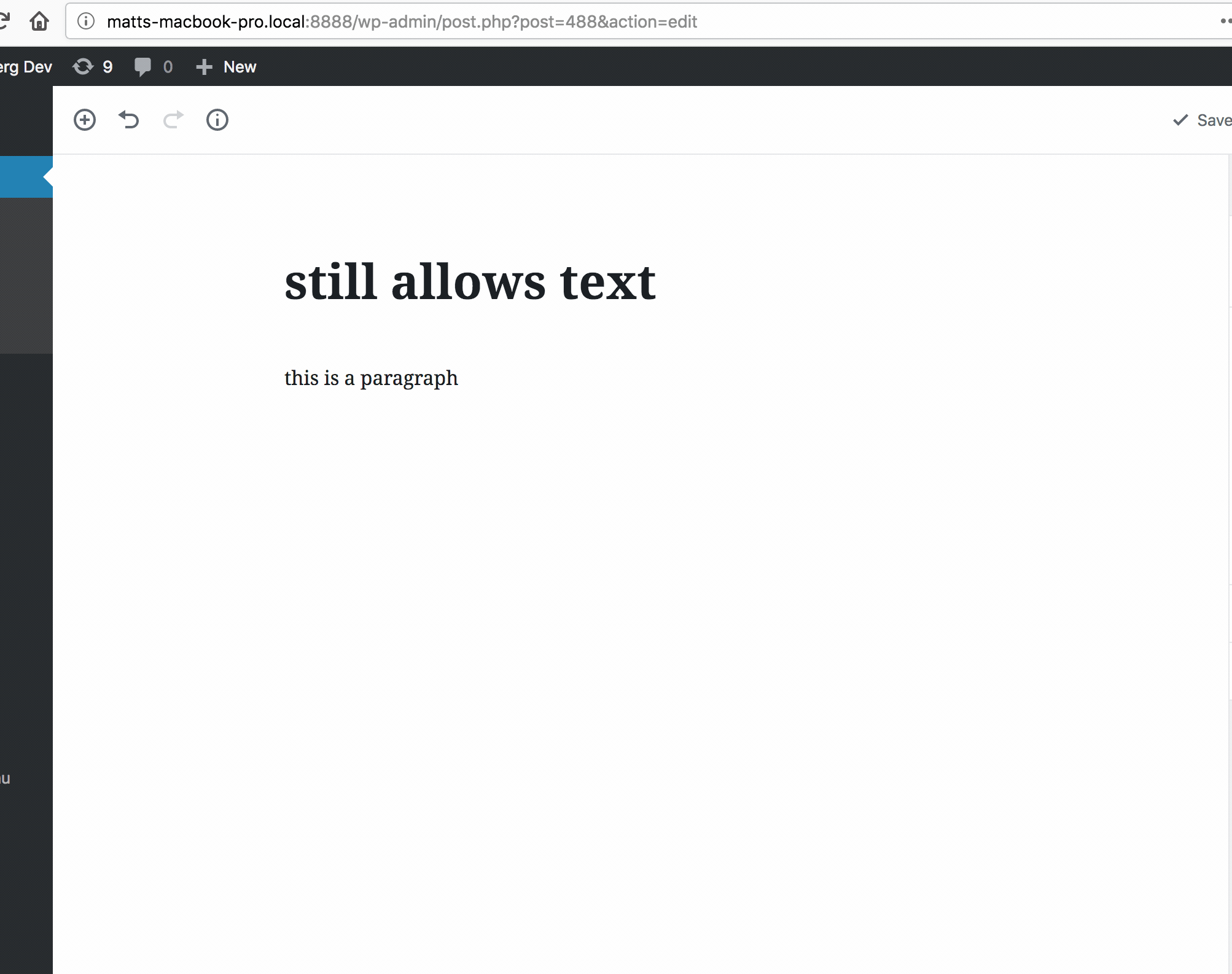
I guess that's true of the existing implementation, right? Do we consider that a bug?
Anyway, code looks mostly good, just some minor tweaks. Tested in IE 11 and seems good there too; I wanted to test there because some flex stuff can be weird there, but it all seemed good.
Might be a good case for an E2E test as this is might not be something routinely tested by us in development.
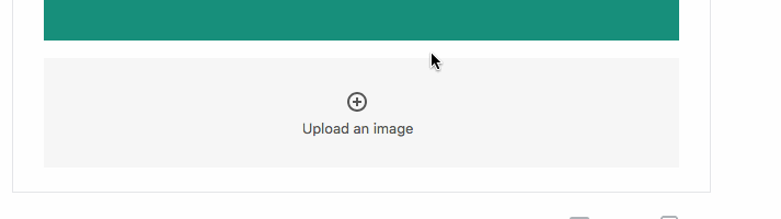
My only issue is the block appender seems like it should have a larger click target:
It seems annoying to have to move my mouse to the centre; that's a tiny click target and we could expand it to the whole area.
| return null; | ||
| } | ||
|
|
||
| let defaultLayout; |
There was a problem hiding this comment.
I don't see this being redefined, would it be better to just have this be a ternary?
const defaultLayout = isGroupedByLayout ? layout : undefined;
// Or even?
const defaultLayout = isGroupedByLayout && layout;
|
@jasmussen I tried tweaking the design as suggested, feel free to polish further. |
| padding: 10px; | ||
| border: 1px dotted $light-gray-500; | ||
| padding: 20px; | ||
| outline: 2px dotted $light-gray-500; |
There was a problem hiding this comment.
Is "dashed" horrible looking? 😅
(if it is, that's fine, but I like the idea of the line being dashed because that feels more "fill this in" to me)
Also, can you use $grid-size-large instead of 20px? I'm slowly trying to introduce a base8 grid across Gutenberg.
We don't like filters a lot here :). Source of buginess :P |
|
@youknowriad I think a post-type level setting would be a nice alternative over a filter too. The main thing is that the default paragraph appender isn't always the best user interface when dealing with certain types of content, even in cases where the paragraph is an allowed block, and it would help to allow developers to be explicit about that rather than depending on Gutenberg to infer it. |
This is definitely a bug, good catch, I created a specific issue for it #10186 |
|
I added an e2e test, not sure what's left to land this in 4.0 |
|
I pushed a small tweak to the visuals:
|
| await switchToEditor( 'Code' ); | ||
| await page.$eval( '.editor-post-text-editor', ( element, _paragraph, _blockSlug ) => { | ||
| const blockDelimiter = `<!-- /wp:${ _blockSlug } -->`; | ||
| element.value = element.value.replace( blockDelimiter, _paragraph + blockDelimiter ); |
There was a problem hiding this comment.
I think `${ _paragraph }${ blockDelimiter }` is a bit more readable (it's instantly recognisable as a string rather than doing concat), but it's pretty minor.
There was a problem hiding this comment.
(I know this is unrelated to your patch, but I'ma make the change because it's nicer.)
|
Thanks for the tweaks :) |
|
@youknowriad @jasmussen Would it make sense for this new appender design to apply to the Gallery image appender as well? I could see it being nice to have the same design since they are similar UIs, same icons, etc. Happy to open a PR if so :) |
|
@chrisvanpatten Yes, it does. I think the component is different but the design should definitely match. Some explorations are happening here #9682 |
|
@youknowriad Oh cool, I'll let those explorations proceed then! 👍 |
I actually think those explorations, although on a PR, have somewhat stalled. So Chris if you have an ocean of bandwidth and desire to contribute, I can offer you an emoji medal for it, and I would suggest you work off of the mockups present here: #9682 (comment) An interim step can be as little as the visual styles, and a bigger step could be adding the additional button. But just to be clear, don't let that pull request block you from making one yourself! |
| return { | ||
| title: getEditedPostAttribute( 'title' ), | ||
| insertionPoint, | ||
| insertionPoint: { |
There was a problem hiding this comment.
We should almost never want to create a new object to be returned as a value of mapSelectToProps return value object. It forces a component render on every single change to any registered store.
See: #11028
|
Looking into this: this new appender doesn't make its name visible to users. Any UI control needs to expose its name visually: for example, speech input users need to know the name of a control to be able to voice a proper command. For optimal accessibility, the name should be visible. Gutenberg uses tooltips, which are already a trade-off but this button should have at least a tooltip. Will create an issue and PR. |
closes #8589
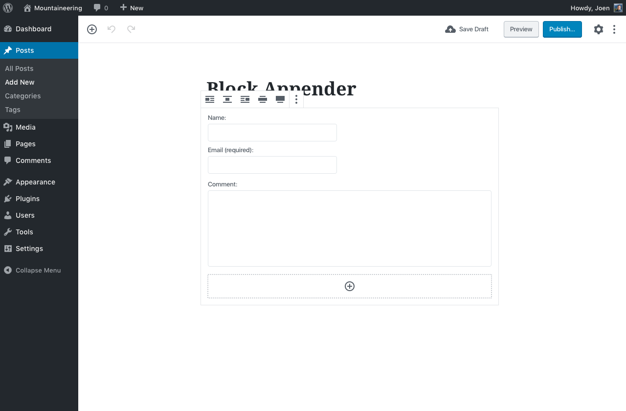
This PR adds a new block appender that trigger only when the parent block doesn't support the default block. (paragraph).
To test it, try registering this block (copy/paste to the console)