-
Notifications
You must be signed in to change notification settings - Fork 4.2k
New issue
Have a question about this project? Sign up for a free GitHub account to open an issue and contact its maintainers and the community.
By clicking “Sign up for GitHub”, you agree to our terms of service and privacy statement. We’ll occasionally send you account related emails.
Already on GitHub? Sign in to your account
Add container block #13964
Add container block #13964
Conversation
|
Hey @melchoyce - This is a very stripped down version of the block to start with. Let us know if you think there's anything else that needs to be added to this initial version. 😄 |
|
Ohhhh, that's so great. Thank you so so much for working on it. The solution to work first on a lite version and to extend the piece by piece I find also very good. |
|
You guys should consider blocks for all the HTML5 semantic elements (aside, article, main, etc.) |
|
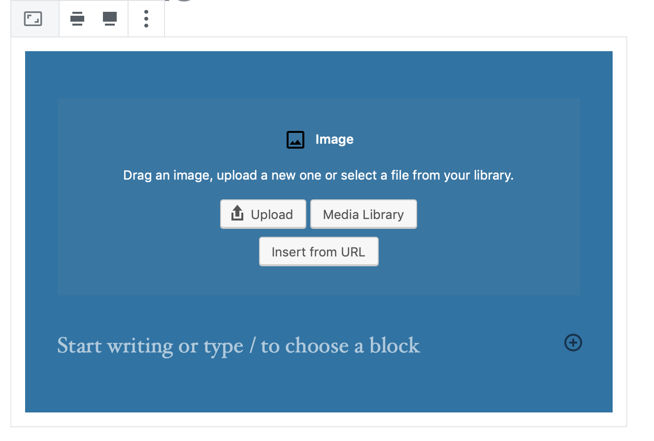
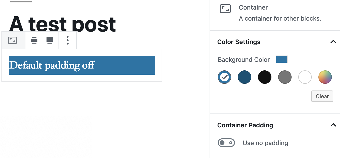
🎉 This is brilliant, Dan. Great progress so far. A couple small notes after giving this a quick test: First, I'd love to get that new appender in here. But even without it, this seems incredibly useful. It'd be great to reuse some of the thinking around light/dark styles from the Cover PR, as some of the UI elements seem a little hard to see against the default background. Specifically the placeholder color + icon colors in this screenshot: Second, the label for the padding setting was a little confusing: I'd expect the
(In this case, |
|
Can you tell me more about the decision to add the padding toggle, and what it does? Here's the block icon: https://cloudup.com/cY08t7GudsC (need to download it to preview) |
|
Hi @kjellr, We've tiptoed a lot around this padding setting :) and indeed to us also it sounded a bit off "to enable a toggle to disable a feature". I think your suggestion is awesome and so I've modified the behaviour to be like so. Also found that due to the changes the save function was missing the correct classname/attributes for the padding and I've also fixed that. Now we have this: |
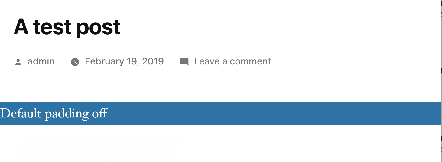
Hi @melchoyce ! The padding toggle is the result of the fact that when the section block is in full width mode the content gets stuck to the edges of the viewport and for text, for example, that looks like it is undesirable: The toggle adds or removes a default of: Initially we added the padding setting as a slider that set an inline value for it, but dropped it because we thought it would be hard to be overridden by themes. Then we figured some sensible defaults would work, and that resulted in a dropdown where you could set a "narrow" or "wide" padding, and I think there were some other approaches but ended up with this toggle. |
|
Why not allow the InnerBlocks to decide their own width? Edit: So, assume default padding, but allow InnerBlocks to be wide or full-width |
@melchoyce I definitely agree the padding option is not ideal, we struggled to find a good solution off the bat, so went with something simple so that we could at least make a draft PR and get some feedback. The main issue is that by default blocks are 100% wide so that they're responsive. When the container is set to full-width the inner blocks expand to take up that space. A lot of the inner blocks don't have their own alignment options (e.g. paragraph) and there's also no option to set them back to their normal width within Gutenberg. Also, from the editor's point of view we don't know what that normal width is, as the theme defines it. The container from the stackable plugin tries to solve this providing a second set of alignment (full-width, left, center, right) options: We could go with something like that. I think it'd be great to have a different icon set for this, and also to provide that 'normal' option, which themes could provide a style for. Another option is to nest a container block within a container block and have the inner container provide that option, but I don't think that'd be as user-friendly. |
Yeah, let's avoid having another layer of nesting.
Let's think about this option more. In the meantime, what if we excluded the toggle, and always apply the padding? Themes can override if necessary. |
|
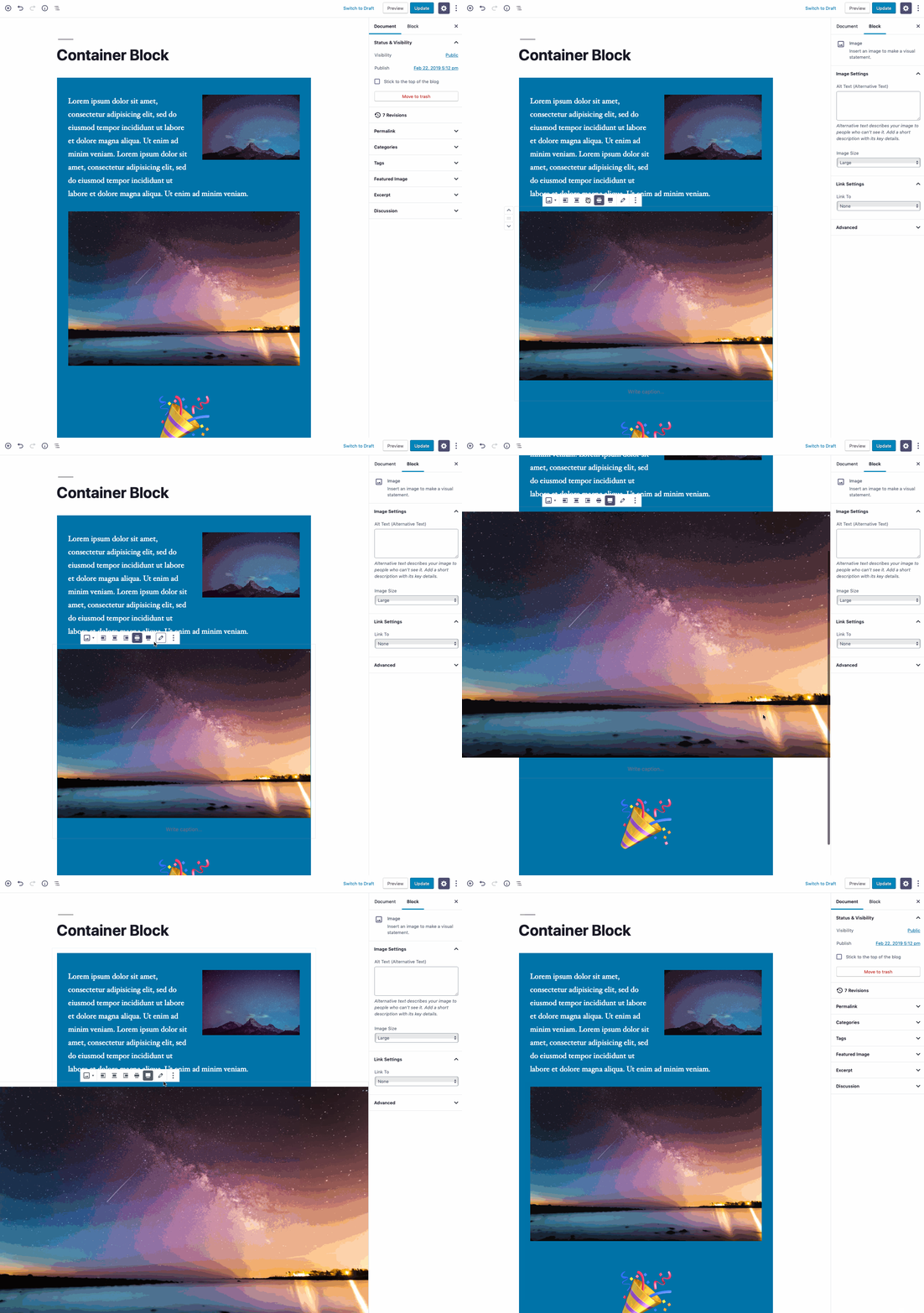
Just wanted to add a note that Twenty Nineteen (presumably along with some other themes) will need a patch in order to properly support wide/full alignments of InnerBlocks. Currently it gets a little weird: (^ In this screenshot, the image is set to be full-width) I'm happy to work on that part, once this PR gets a little farther along. 👍 |
@kjellr That also happens if the container is full width. Apparently there are some calc() CSS lines that send the inner contents off. Also, because of the active theme's effects in the editor, when setting these things, e.g. the container full width and an image full width looks bad in edit mode too. I wonder, if a theme has poor implementation of CSS for some blocks does the user understands this or do they believe that the editor is broken? E.g. |
@draganescu Yes, I mean get rid of the toggle that removes padding, and rely on themes to override the default padding the block provides. |
Yeah, there are a lot of things that'd need to be sorted out. Twenty Nineteen wasn't really written with this sort of thing in mind, since it didn't exist yet. 😄 It's all fixable though.
They definitely believe the editor is broken! But that's our incentive for building this in a way that's as compatible with themes as possible. I'm not sure there's a way around it, but ideally, we don't want themes to have to patch for this functionality. |
|
Just a quick update from a theme perspective: I spent a little time trying to build proper wide/full child block support for this block into Twenty Nineteen, and the good news is... it wasn't that tough. The bad news is... it's fairly complicated. The width and amount of negative left positioning for wide + full child blocks needs to be adjusted to include the padding + block margins for the container block. This is fine, and an extension of what the theme has now. The real complication is that this needs to be re-adjusted for each alignment variation (standard, wide, and full) of the container block and for three breakpoints for each one of those variations. 😩 I don't see any real way around this for now, but I'll keep digging. |
|
I also have a conceptual question: If you're using a container block, it's supposed to "contain" the content inside of it, right? So does it make sense to allow for blocks that can extend beyond the boundaries of the container in the first place? |
Conceptually not, but look at the creative effect you've got in your demo above :) I see no reason to disallow it if it is possible to implement properly! |
Well, I do think it'd be less complicated to implement if they did not break out of the containers. 😄 |
|
I don't know if it fits the conversation, but I think it is also used in practice:
It's so great you're working on the container block. If you only imagine what you can do with it. Instead of installing plugins to get an alert box, I'll design it myself and save it as a reusable blog. How cool is that? |
@afercia I take your point and we can consider those in another PR. It's totally possible for Gutenberg to "upgrade" any Blocks created with the current version of the Block as and when we decide to enhance it so we are covered for that.
@afercia Thank you. Whilst I appreciate your concern and foresight, it's my understanding that the Gutenberg Blocks are not necessarily expected to map 1:1 with HTML5 elements directly. As a result, I'm doubtful we will ever see any Block that simply implements the There isn't one naming convention that is going to address all the concerns and viewpoints held by people interested in this Block (and there have been many in this PR 😄). Therefore I'm going to suggest that in the interests of getting a v1 of this Block shipped we move any discussion around the naming of this Block into a dedicated Thanks again for taking the time to feedback. |
|
Sure, let's postpone the naming issue.
Whether they will be blocks or something else, at some point Gutenberg will need a way to render |
Status✅ Minimal feature set implemented Now awaiting @youknowriad's confirmatory technical review (incoming). |
There was a problem hiding this comment.
Choose a reason for hiding this comment
The reason will be displayed to describe this comment to others. Learn more.
I quickly skimmed code. It all looks solid as far as I can tell after 5 minutes. I would be interested to see how developing blocks evolve on the parent with child interaction level after this change lands. It's becoming obvious that whatever can be applied to the section block should be abstracted away so it could be easily applied for other blocks as well.
There was a problem hiding this comment.
Choose a reason for hiding this comment
The reason will be displayed to describe this comment to others. Learn more.
Looks good to me code wise.
What do you think about this in relation to the editor and theme styles @kjellr
- How does it behave in a theme without any gutenberg support?
- Is it "easy" to provide styles for the alignments in themes?
|
To confirm I will merge this today as soon as @kjellr confirms @youknowriad's points. |
On a theme with no Gutenberg support at all, the wide/full alignment options for the section block disappear (as well as the wide/full alignments of all children). So that'll work as expected by default. If a theme has declared Gutenberg support for wide/full, this should generally work well in the editor. Theme authors may need to patch their editor styles to ensure that the exact width of wide-aligned child blocks match up with the width they're using in their theme. The front end's a little different though: Gutenberg does not provide any front-end styles for wide/full alignment in general, and that has not changed here. In most cases, a theme's existing wide/full styles will not automatically work inside of the section block. Theme authors will need to build styles for wide/full child blocks for the front end. Usually, these will be variations of the themes' existing wide/full styles, but nested inside of a If a theme does something advanced with the wide/full alignments (like Twenty Nineteen does, where it left-aligns them), things will probably be a bit more messy, and will require a more complicated fix. Regarding the default themes:
It varies greatly on how the theme has implemented wide/full. In the Gutenberg starter theme for instance, this only requires 4 new css rules (example here). For Twenty Nineteen, it's many, many more than that. Once I get Twenty Nineteen patch ready, I'll update our documentation to make note of this. (In general, our documentation around wide/full alignments is very slim). |
|
🎉 Awesome work everyone. |
| ] } | ||
| /> | ||
| </InspectorControls> | ||
| <div className={ classes } style={ styles }> |
There was a problem hiding this comment.
Choose a reason for hiding this comment
The reason will be displayed to describe this comment to others. Learn more.
There was a problem hiding this comment.
Choose a reason for hiding this comment
The reason will be displayed to describe this comment to others. Learn more.
|
The "classic" ( |




Now renamed to "Section" (by popular demand)
Closes #4900
Description
Adds a basic version of a new Container block. This block supports:
The ability to remove the default paddinNot included:
InnerBlocksdoesn't support this out of the box, so it will need some exploration in a separate PR.Todo
paragraph?reusable?SectionvsContainer- then update all referencesWhat to test
If you'd like to test this Block the main features to focus on are:
For #2 you can utilise @getdave's Plugin which will auto-generate a series of
SectionBlocks for you in various alignment combinations.A good first test scenario might be:
cover,columns,image...etc). Do these settings respond as expected? How about when you change the Section Block alignment settings at the same time?As a second pass find some common web layouts and try and recreate these using the Section Block.
How has this been tested?
Expected result:
The
containerSection block should appear as expectedScreenshots
Types of changes
New feature (non-breaking change which adds functionality)
Checklist: