-
Notifications
You must be signed in to change notification settings - Fork 4.2k
New issue
Have a question about this project? Sign up for a free GitHub account to open an issue and contact its maintainers and the community.
By clicking “Sign up for GitHub”, you agree to our terms of service and privacy statement. We’ll occasionally send you account related emails.
Already on GitHub? Sign in to your account
Columns: Improve margins, column child block, mobile. #11904
Conversation
|
@youknowriad I don't know whether to put this in 4.4 milestone or 4.5 — one one hand it would be good to get this in, but on the other hand I don't know how urgent it is, and I know that 4.4 is due right now, so I'll let you milestone this. |
|
If it's merged it'll become 4.4 :) |
| @@ -808,10 +808,10 @@ | |||
| } | |||
|
|
|||
| // Don't do it for wide elements, this causes a horizontal scrollbar. | |||
| &[data-align="full"] .editor-block-contextual-toolbar { | |||
| /*&[data-align="full"] .editor-block-contextual-toolbar { | |||
There was a problem hiding this comment.
Choose a reason for hiding this comment
The reason will be displayed to describe this comment to others. Learn more.
Is this meant to be removed?
There was a problem hiding this comment.
Choose a reason for hiding this comment
The reason will be displayed to describe this comment to others. Learn more.
Yes, sorry about that.
That rule was needed at one point, but appears to have been refactored out. There's a lot of cleanup in this PR. I pushed a fix to remove it.
|
To expand a little on this:
We could simply decide that a full-wide block has margin left and right, both on the frontend and in the backend, just like how we are deciding that it should have spacing between the columns. This would serendipitously fix any side UI issues. For now I've avoided this. |
That seems like cheating our way to a "fix". It doesn't actually solve the problem, because what if you have a theme that makes the full-width blocks actually be 100% width? |
FWIW, I think this is the best way forward. Columns full of images look great when they're full-width, but any text-based ones bleed into the edges. I'd rather Gutenberg added margins by default, and theme authors manually overrode that on the front end if for some reason they'd prefer to. That would:
|
|
The fullwide margin change would probably be something to do separately from this PR, just to keep things focused. I suspect phase 2 will rethink aspects here as well, so maybe keep those changes for that round of improvements, and accept the visual disconnect for now. |
There was a problem hiding this comment.
Choose a reason for hiding this comment
The reason will be displayed to describe this comment to others. Learn more.
Let's get it in
|
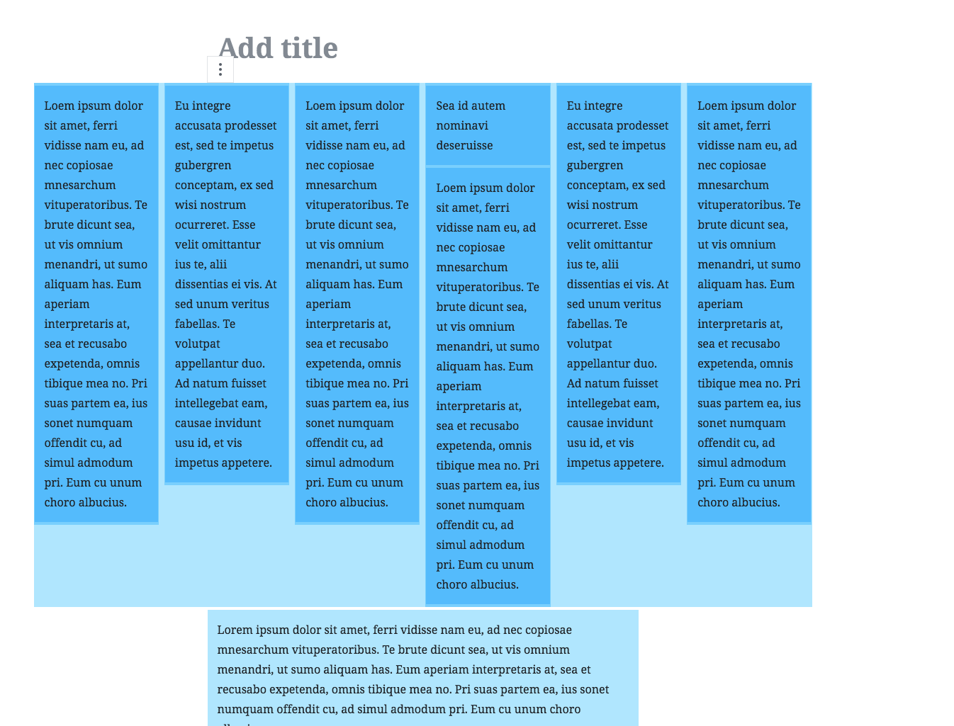
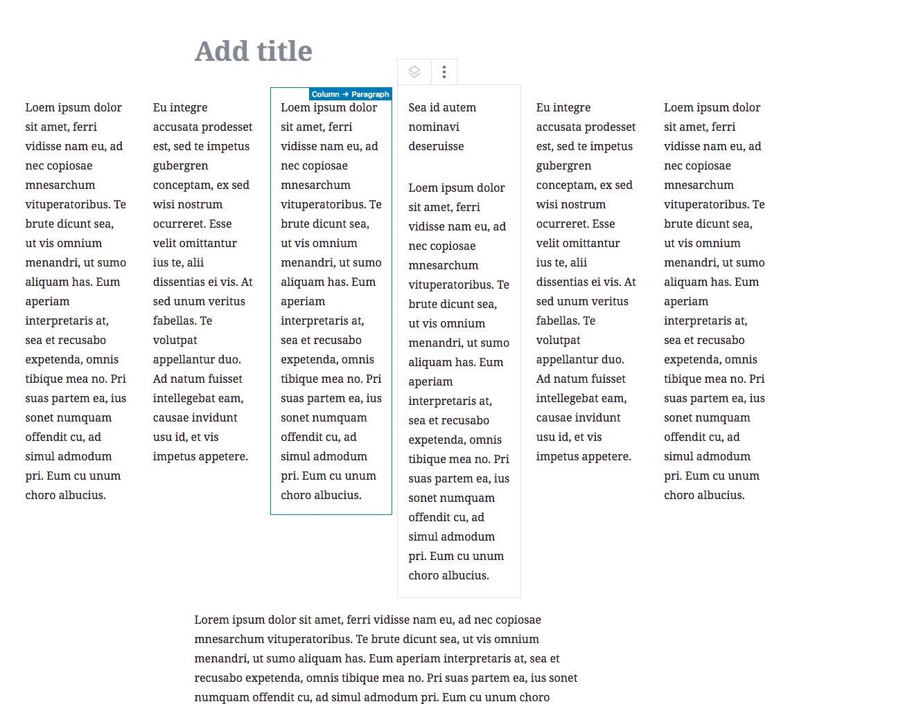
So, in testing this extra thoroughly, I noticed a regression with more than 2 columns which I fixed in 42be6c2. While not a huge change, it is a change since the review. Here are screenshots: Testing everything yet again for a final sanity check. |
|
Sadly, I've discovered in additional testing that this needs a little more time in the oven. Thanks all. |
|
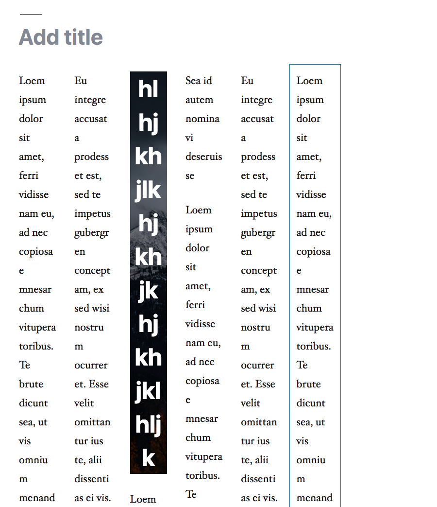
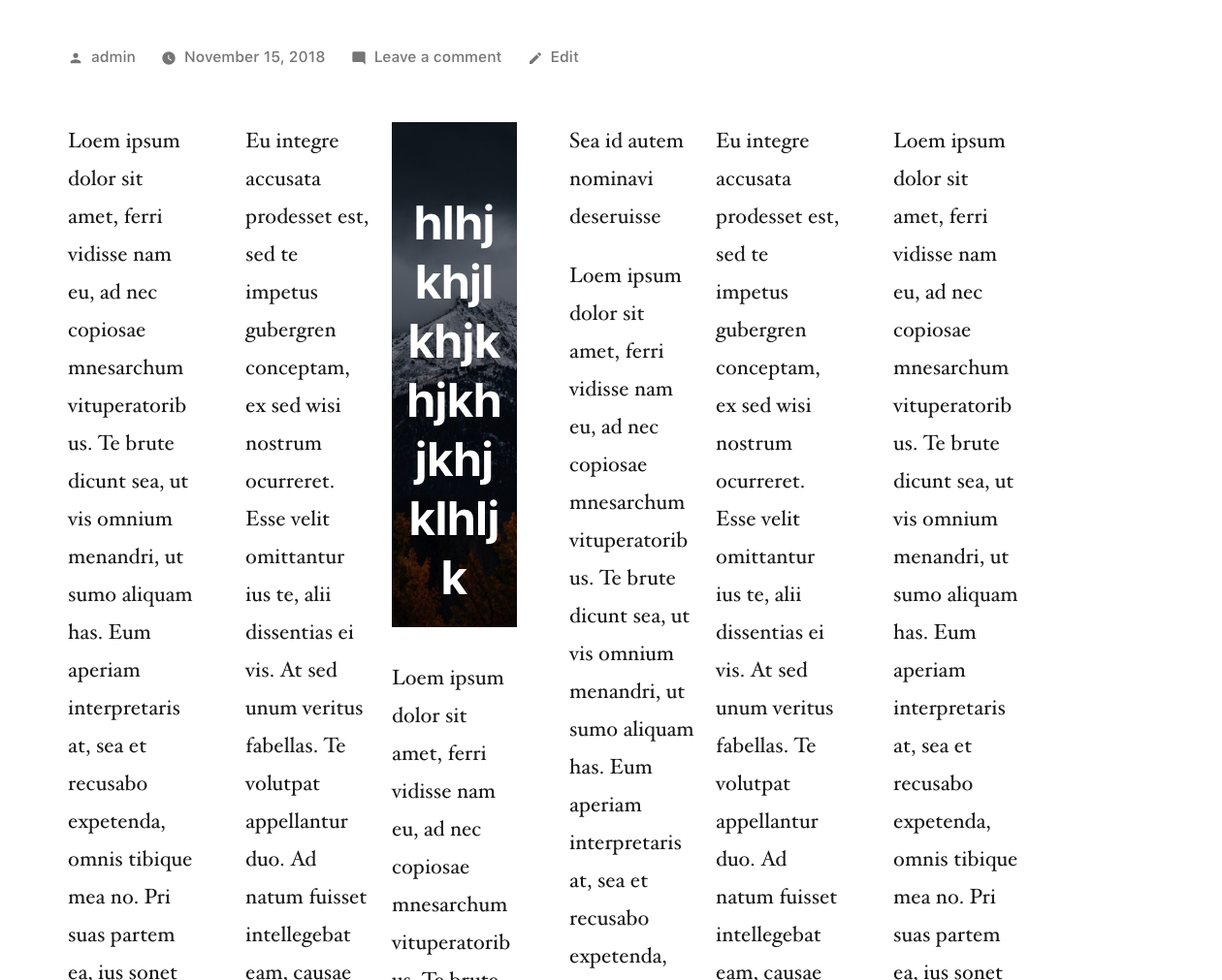
Thanks to @kjellr for helping me test this. We discovered an issue — this is also present in master — where if you typeareallylongwordlikethisbutultrasuperlong in a column, that word would be unbroken, and the column would grow. This issue was not very visible if you used few columns. But as soon as you're at more than 3 columns with varied content, the issue became clear: This was fixed by adding the following to each individual column: Result editor: Frontend: I have tested this in Firefox and Safari and Chrome, and it seems to be solid. |
This PR aims to further improve the columns block, and improving a number of aspects and addressing recent feedback.

- It fixes an issue where fullwide columns had uneven margins, both left, center and right. Fixes #11869.
- It fixes a specificity issue with toolbar and breadcrumb positioning that bled into all child blocks.
- It improves the layout of individual column blocks, and fixes the toolbar positioning. This fixes feedback in #7766 (comment).
- It improves fullwide columns and how they appear on mobile.

Aside from that it simplifies the code a bit, and removes a couple of redundant overrides that were better fixed elsewhere.
7be98f8
to
dbe5225
Compare
There was a problem hiding this comment.
Choose a reason for hiding this comment
The reason will be displayed to describe this comment to others. Learn more.
This is looking good. Aside from the issues that were raised (and subsequently fixed) above, I haven't found anything that'd hold this back.
I've tested on Mac OS 10.14, with Chrome 70.0.3538.102 and FF 63.0.1. Using both the Twenty Nineteen + Gutenberg Starter themes.
- I'm able to select column block, columns, and child blocks using the keyboard.
- I'm able to select just the column block and child blocks using the mouse.
- alignwide column block looks much better on small screens than it did before.
- Frontend looks good.
- All toolbars work in my testing.
- I'm able to multi-select blocks within a column
- The columns block works as expected when it's empty.
- Typing averylongwordthatgoesonforever in a column no longer breaks everything.
| @@ -147,6 +137,7 @@ | |||
| } | |||
| } | |||
|
|
|||
| :not(.components-disabled) > .wp-block-columns > .editor-inner-blocks > .editor-block-list__layout > [data-type="core/column"] > .editor-block-list__block-edit .editor-inner-blocks { | |||
| // This selector re-enables clicking on any child of a column block. | |||
| :not(.components-disabled) > .wp-block-columns > .editor-inner-blocks > .editor-block-list__layout > [data-type="core/column"] > .editor-block-list__block-edit .editor-block-list__layout > * { | |||
There was a problem hiding this comment.
Choose a reason for hiding this comment
The reason will be displayed to describe this comment to others. Learn more.
Do we really need all this specificity
| @@ -46,47 +48,41 @@ | |||
| // The Column block is a child of the Columns block and is mostly a passthrough container. | |||
| // Therefore it shouldn't add additional paddings and margins, so we reset these, and compensate for margins. | |||
| // @todo In the future, if a passthrough feature lands, it would be good to apply these rules to such an element in a more generic way. | |||
| margin-top: -$block-padding - $block-padding; | |||
| margin-bottom: -$block-padding - $block-padding; | |||
| > .editor-block-list__block-edit > div > .editor-inner-blocks { | |||
There was a problem hiding this comment.
Choose a reason for hiding this comment
The reason will be displayed to describe this comment to others. Learn more.
Weird to rely on > div > can't we have a className or something?
|
Thanks for your work @kjellr and @jasmussen I'm including this in the release. Let's follow-up if we catch any regression. |
|
Thanks for continuing to refine this. |
|
Thanks so much for all the help yesterday. I will continue to monitor any issues that relate to this block and the refactor, but structurally I'm very happy to have this in. |
|
Just tried 4.4, I really like the refinements from this pr ❤️ |
|
Columns Block should be done as majority of visual theme editors do it. Not to be done according to how it looks on front-end, and trying to replicate same look in editor. Just find some visual editor you favor, and take inspiration from it. |


This PR aims to further improve the columns block, and improving a number of aspects and addressing recent feedback.
Aside from that it simplifies the code a bit, and removes a couple of redundant overrides that were better fixed elsewhere.
Worth noting — a fullwide columns block is still not perfectly 1:1 representative of what it will look like on the frontend, as is noted in https://github.com/WordPress/gutenberg/compare/improve/columns?expand=1#diff-49ac41bc72e24e343a451fe254801c0fR16. This is in order to make room for the side UI (movers on child blocks), and I expect us to still revisit this at some point.
This PR has been tested using RTL language, on mobile and desktop breakpoints, in vanilla editor styles and in TwentyNineteen.
GIF: