-
Notifications
You must be signed in to change notification settings - Fork 4.2k
New issue
Have a question about this project? Sign up for a free GitHub account to open an issue and contact its maintainers and the community.
By clicking “Sign up for GitHub”, you agree to our terms of service and privacy statement. We’ll occasionally send you account related emails.
Already on GitHub? Sign in to your account
Add landmark regions #2380
Add landmark regions #2380
Conversation
Codecov Report
@@           Coverage Diff            @@
##           master   #2380     +/-   ##
========================================
+ Coverage    25.9%   33.3%   +7.4%
========================================
  Files         157     183     +26
  Lines        4849    7020   +2171
  Branches      820    1379    +559
========================================
+ Hits         1256    2338   +1082
- Misses       3033    3845    +812
- Partials      560     837    +277
Continue to review full report at Codecov.
|
|
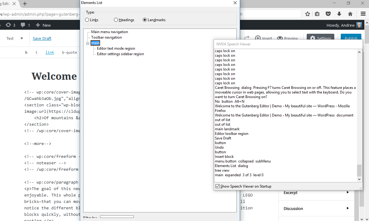
First off, thanks so very much for working on this. 🍷 This seems good to me. I think moreso than me, this PR needs the eyes of accessibility experts like yourself or Joe or Rian. I wish we could've kept the semantic I noticed the two regions, "Editor text mode region" and "Editor visual mode region". Is there any way we can label these to make it clearer that they are both to versions of the same? Something something "Editor content region, text mode", or something in that vein? |
I'm not sure the whole semantics of header + H1 is so appropriate, since we're in an authoring context. Will try to discuss this in the next a11y meeting. Re: labels: sure they can definitely be improved. Just keep in mind the word "region" is added by the screen reader and it's not part of the actual label. |
|
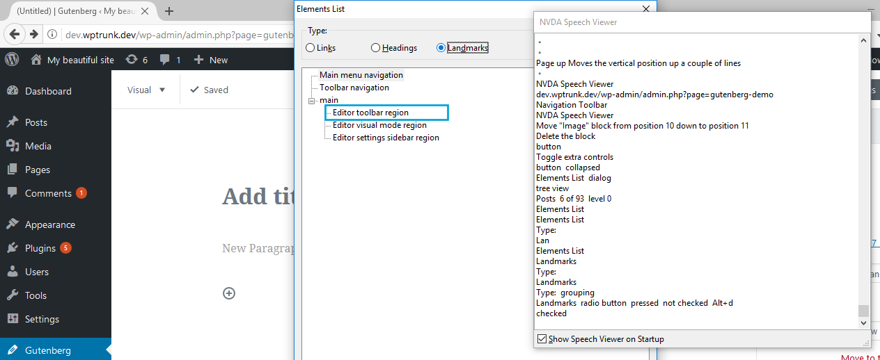
Re: NVDA not announcing the editor toolbar landmark: seems NVDA doesn't like nested landmarks when there's no content between them. Actually, between the div with I've noticed this when completely disabling styles in Firefox: then the toolbar region gets reported: Also adding just a To fix this I'd say there are two options:
I'd lean towards the first option, for consistency and because we need a main H1 to give users feedback about what the page is about. This should be addressed in #503 so I'm considering to use a temporary fix for now. |
|
Thanks for the review! |
Display content information metrics


Partially addresses #467
This PR tries to introduce an easy way for screen reader users to jump through the main editor sections via ARIA landmark regions.
All the major screen readers support landmarks: they're just HTML elements with special semantic meaning (nav, main, aside, etc.) or div elements with special ARIA roles (main, complementary, region, etc.).
We've discussed this in a recent accessibility team meeting (see #467) and initially decided to use
aside. However, I'd propose to use the generic roleregionbecause:https://www.w3.org/TR/wai-aria-practices/#aria_lh_complementary
Instead, the editor is nested within the main content.
So,
regionseemed more appropriate to me. Reference and examples:https://www.w3.org/TR/wai-aria-practices/#aria_lh_region
https://www.w3.org/TR/wai-aria-practices/examples/landmarks/region.html
I'd appreciate some feedback about the aria-label values, especially thinking at how they would be translated in other languages. /cc @joedolson @rianrietveld and everyone.
Screenshots with Safari + VoiceOver:
I had to change some elements to clean-up some semantics. For example the
headerused for the text mode quicktags was reported as a "banner" landmark: