-
Notifications
You must be signed in to change notification settings - Fork 4.3k
New issue
Have a question about this project? Sign up for a free GitHub account to open an issue and contact its maintainers and the community.
By clicking “Sign up for GitHub”, you agree to our terms of service and privacy statement. We’ll occasionally send you account related emails.
Already on GitHub? Sign in to your account
Add word and block count to table of contents #2684
Conversation
Codecov Report
@@            Coverage Diff             @@
##           master    #2684      +/-   ##
==========================================
- Coverage   33.69%   33.61%   -0.09%
==========================================
  Files         185      188       +3
  Lines        5594     5867     +273
  Branches      976     1051      +75
==========================================
+ Hits         1885     1972      +87
- Misses       3141     3280     +139
- Partials      568      615      +47
Continue to review full report at Codecov.
|
editor/table-of-contents/index.js
Outdated
| <span className="table-of-contents__title">{ __( 'Table of Contents' ) }</span> | ||
| <div className="table-of-contents__items"> | ||
| <ul>{ tocItems }</ul> | ||
| </div> |
There was a problem hiding this comment.
Choose a reason for hiding this comment
The reason will be displayed to describe this comment to others. Learn more.
maybe we could split out the TableOfContent to its own subcomponent and rename this one PostInfo or something?
There was a problem hiding this comment.
Choose a reason for hiding this comment
The reason will be displayed to describe this comment to others. Learn more.
Document Outline may fit.
|
Could the "count" cards have a fixed width (50%) with a centered number and caption? |
|
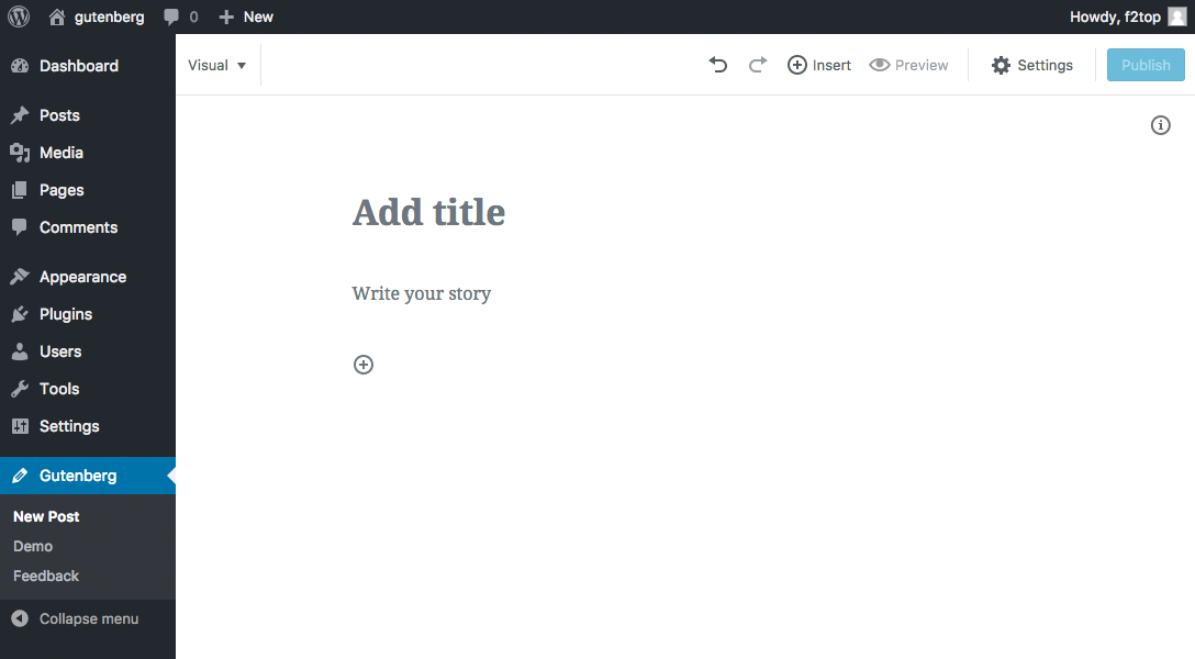
The placement of this new feature ("Info" button and Popover) doesn't seem ideal to me. "Info" seems placed there just because there's some available space, There's no logic in the placement in the source order, nor this control is grouped logically in an area where it would make sense. As a user, a label "Info" doesn't tell me so much. I'd be forced to explore the content to understand what it is. The Popover component has pending accessibility problems tracked in other issues so I won't go in depth, but moving the Table of Contents here make the assistive technologies users experiences worse. It was far better when placed in the sidebar. |
|
I would suggest just showing the number of words as the author types, it increases for each word typed. It could be a color or underlined, or have the icon next to it add affordance, and when clicked shows the additional info about blocks and headings, etc. |
|
First up, really cool to see this feature. I think it's going to be useful and can already see the types of users will really benefit from this. @afercia, the position is one that I really think we need to do testing at this point with. As you know, I love testing and I think getting something like this in is good, to then test and get feedback. After all we can iterate around where it goes and what it says. How about we get it in, run testing and see if we can't actually improve the accessibility of it right there? I think we can at least try. I would +1 to merging it in, with the thought we need to iterate and do both usability and accessibility testing on this. |
|
@karmatosed of course I'm not opposed to testing, as long as testing includes users with different abilities, keyboard users, and assistive technology users. As a general consideration, it would be great to start thinking at accessibility as part of the design process. A very important, first, step in accessibility is about building well structured, semantic HTML. The order of the main sections should be clear and intuitive. It should facilitate navigation through content and make easy to get an overall sense of the document. User interface controls should be grouped logically and placed where it makes the most sense, where they can be easily and intuitively found. It's about designing the information architecture of an HTML document. This whole process (not to mention interaction and many other things) is actually a design process. Instead, starting from mockups (or first implementations) that don't address (or don't fully address) accessibility, and then saying "and now please add accessibility", is a very ineffective process. When important technical and design decisions have already been made, then it's just too late for accessibility. At that point, we can just try to “patch” here and there, in the hope to reduce the most severe accessibility barriers. This way, we may achieve technical compliance (maybe) but with a compromised user experience. Back to this PR, I'll try to highlight some points and why I feel this PR is not ready for merge and would need some serious re-thinking; Accessibility:
Accessibility/Usability:
Technical/implementation reasons:
I'll skip many other considerations related to implementation details (aria-expanded, focus style, etc.). Overall I feel this is largely unfinished. Just my personal opinion of course, but I think the flaw in the TOC interaction (continuous open/close/open/close) is enough to understand the Popover is not the right component to use for the TOC. |
editor/table-of-contents/index.js
Outdated
|
|
||
| const getHeadingLevel = heading => { | ||
| switch ( heading.attributes.nodeName ) { | ||
| case 'h1': |
There was a problem hiding this comment.
Choose a reason for hiding this comment
The reason will be displayed to describe this comment to others. Learn more.
There was a problem hiding this comment.
Choose a reason for hiding this comment
The reason will be displayed to describe this comment to others. Learn more.
I don't recall actually encountering lowercase nodeNames, I believe this was just some defensive coding that seemed to have minimal cost.
|
Since there are a few things we need to polish here, I'm going to keep the headings in the sidebar and just duplicate them on the popover for now. Once we are satisfied we can consolidate.
I agree these are information elements, but I disagree they have to be in the sidebar. Perhaps we need another landmark region for this.
The popover remains open when you click on a heading item.
For sure, this is just a bug. :) I think we should show it only if there's some content (any content) but not on a plain new post. Thoughts?
|
I disagree. Landmark regions should be kept to a minimum and not added just to meet a visual design. Landmarks identify sections with logically related content. tink for example to a
And closes as soon as you start editing the heading, or am I wrong? Lastly, the aria-label |
|
I had a chat with @afercia earlier today and would like to summarise that here what we discussed.
We had a good chat about a lot of things and going forward things which are design feedback, not just accessibility, will be split from accessibility requirements. This doesn't mean we won't look at both, it's just so we can get a baseline accessibility in and then build amazingly up from there. As design is subjective, we need to focus on the actual requirements for accessibility that sometimes get lots in a subjective debate. |
|
Sorry maybe I was not clear but using a title attribute is not an option. In the last months / years WordPress has been progressively removing title attributes from the admin, as they're often ignored by users and assistive technologies. As a best practice, important information shouldn't rely on the title attribute. There are two options I can think of:
I guess the misunderstanding comes from the confusion between "title" as title of the heading and "title" as title attribute... anyways, we should avoid to introduce new To get an idea of the progress in removing title attributes from WordPress so far, see https://core.trac.wordpress.org/query?keywords=~title-attribute and see also the data reported in https://make.wordpress.org/core/2017/05/26/tag-cloud-widget-changes-in-4-8/ (occurrences of title= (space-title-equal) only within .php files and only in the wp-admin directory) |
fa923c4 to
7c35f64
Compare
|
Realizing that I'm raising the dead here, but the Info icon in the main body of the content feels a bit heavy to me, and every time we add new UI to an already heavy interface it feels like we are regressing a bit. Could we consider putting this information in a future ellipsis dropdown? CC: @karmatosed |
|
@field2 is that icon available in dashicons? The problem with the count being visible is that a number updating whenever you write is distracting. Several new editors are choosing to keep info like this in popovers or panels. |


Closes #1557.
Supercedes #1624.
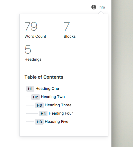
This groups document counts and outline under the same component. It is shown in the main editor body (available when sidebar is closed) and is toggled on demand.
It'd be good to include a brief description of doc outline based on headings. We could also include revisions count here.
To-do: