Responsive API
Responsive layouts in Material Design adapt to any possible screen size. Google's specifications provide guidance that includes a flexible grid that ensures consistency across layouts, breakpoint details about how content reflows on different screens, and a description of how an app can scale from small to extra-large screens.

Developers should consult the HTML Declarative API for specific Static API details, then simply extend the HTML markup usages by adding the responsive suffixes (as discussed below)!
Angular Layout will automatically handle all the details around listening for mediaQuery activations and applying the responsive values to the host DOM elements.
To extend the static API with responsive features, we will first associate specific breakpoint aliases with mediaQuery values.
We can associate breakpoints with mediaQuery definitions using breakpoint alias(es):
| breakpoint | mediaQuery |
|---|---|
| xs | 'screen and (max-width: 599px)' |
| sm | 'screen and (min-width: 600px) and (max-width: 959px)' |
| md | 'screen and (min-width: 960px) and (max-width: 1279px)' |
| lg | 'screen and (min-width: 1280px) and (max-width: 1919px)' |
| xl | 'screen and (min-width: 1920px) and (max-width: 5000px)' |
| lt-sm | 'screen and (max-width: 599px)' |
| lt-md | 'screen and (max-width: 959px)' |
| lt-lg | 'screen and (max-width: 1279px)' |
| lt-xl | 'screen and (max-width: 1919px)' |
| gt-xs | 'screen and (min-width: 600px)' |
| gt-sm | 'screen and (min-width: 960px)' |
| gt-md | 'screen and (min-width: 1280px)' |
| gt-lg | 'screen and (min-width: 1920px)' |
If we combine the breakpoint alias with the static API, we can easily support responsive breakpoints
using a simple markup convention:
The alias is used as suffix extensions to the static API HTML markup:
<api>.<breakpoint alias>="<value>"
[<api>.<breakpoint alias>]="<expression>"
Below is an example usage of the Responsive Layout API:
<div fxLayout='column' class="zero">

  <div fxFlex="33" [fxFlex.md]="box1Width" class="one" ></div>
  <div fxFlex="33" [fxLayout]="direction" fxLayout.md="row" class="two">

    <div fxFlex="22"    fxFlex.md="10px" fxHide.lg                       class="two_one"></div>
    <div fxFlex="205px" fxFlex.md="65"                                    class="two_two"></div>
    <div fxFlex="30px"  fxFlex.md="25"   fxShow [fxHide.md]="hideBox"   class="two_three"></div>

  </div>
  <div fxFlex class="three"></div>

</div>
In the markup above the HTML API directives use both static values and expression bindings; where the values are expressed as raw, percentage, or pixel values.
Note: numeric values not explicitly annotated as
px,vw, orvhdefault to percentage values.
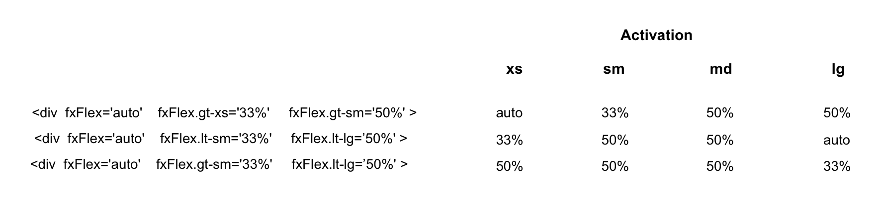
When a breakpoint is activated and the hosting element does NOT have a responsive API defined for the newly activated breakpoint, the Flex-Layout responsive engine uses a fallback, descending-scan algorithm to determine the replacement activation value. The algorithm uses breakpoint priorities to sort activate breakpoints by descending-priority.
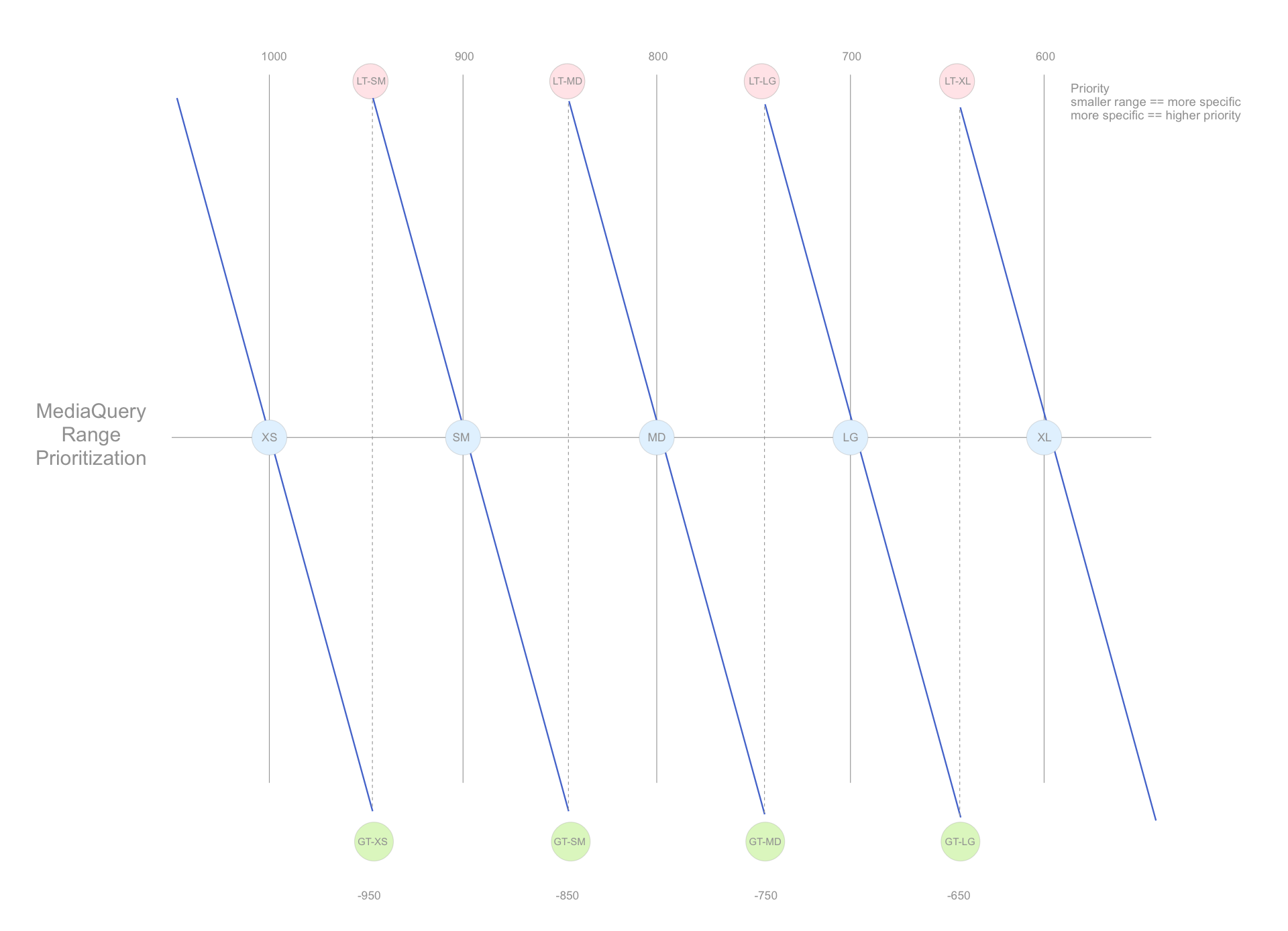
This algorithm searches:
- For non-overlapping breakpoints: the search scans from smallest-to-largest breakpoint range to find the closest, matching activation value.
- (
xs,sm,md,lg,xl)
- (
- For overlapping breakpoints: the search scans from smallest-to-largest breakpoint range to find the closest, matching activation value.
- (
lt-sm,lt-md,lt-lg,lt-xl); wherelt-xlis the largest range - (
gt-xs,gt-sm,gt-md,gt-lg); wheregt-xsis the largest range.
- (
Developers should consider (highest priority to lowest priority) equates to (smallest range to largest range).
Consider the following responsive markup examples:
<div fxShow fxHide.xs="false" fxHide.lg="true"> ... </div>When the activated breakpoint is:
-
xl, then fallback to the default fxShow; so the div is shown -
lg, then the div is hidden (since the value === 'true') -
md, then fallback to the default fxShow; so the div is shown -
sm, then fallback to the default fxShow; so the div is shown -
xs, then the div is shown (since the value === 'false')
<div fxFlex="50%" fxFlex.gt-sm="100%"> ... </div>When the activated breakpoint is:
-
xl, then fallback to 'gt-sm' so the div sizing is 100% -
lg, then fallback to 'gt-sm' so the div sizing is 100% -
md, then fallback to 'gt-sm' so the div sizing is 100% -
sm, then fallback to the default fxFlex="50%"; so the div sizing is 50% -
xs, then fallback to the default fxFlex="50%"; so the div sizing is 50%