-
Notifications
You must be signed in to change notification settings - Fork 8
HowTo : RadioBox widget
 About FAQ User Guide Reference documentation
This wxRuby guide demonstrates how to use the Wx::RadioBox widget with it’s various styles, features and functions. A complete list of options will be included here together with code examples for your convenience.
The syntax for creating a RadioBox widget in wxRuby is as follows:
rb = Wx::RadioBox.new(parent, id, label, pos, size, choices, major_dimension, style, validator, name)Parameter descriptions:
-
parent : Wx::Window
the parent window (widget) such as a Wx::Panel. -
id : Integer
Button ID.Wx::ID_ANYindicates a default value. -
label : String
Optional text which appears on the widget. Empty by default. -
pos : Array(Integer,Integer) or Wx::Point
Optional coordinates for the position of the topleft corner of the widget. Default isWx::DEFAULT_POSITION. -
size : Array(Integer,Integer) or Wx::Size
Optional dimensions of the widget. Default isWx::DEFAULT_SIZE. -
style : Integer
Optional styling mask for the button (such as alignment). Default is 0. -
choices : Array<String>
A list of strings containing the labels for the RadioButtons. Under default circumstances, the number of strings will correspond to the number of RadioButtons created. Default isnil(no labels). -
major_dimension : Integer
Specifies the maximum number of rows (if style contains Wx::RA_SPECIFY_ROWS) or columns (if style contains Wx::RA_SPECIFY_COLS) for a two-dimensional radiobox. The default value of 0 means to use the number of items, i.e.choices.size. -
validator : Wx::Validator
Optional Window validator. Default is nil. -
name : String
Optional window name. Default is Wx::RADIO_BOX_NAME_STR.
Note: As with all windows, keyword constructor alternatives for all arguments but the 'parent' argument are available. See here for more information.
Available styles for the RadioBox widget:
| Button Style | Description |
|---|---|
| Wx::RA_SPECIFY_ROWS | When this style is selected, the value passed to major_dimension refers to max rows. |
| Wx::RA_SPECIFY_COLS | When this style is selected, the int passed to major_dimension refers to max cols. (Default style). |
A list of useful methods which can be used on the RadioBox widget.
| Method | Description |
|---|---|
| enable_item(item, enable) | Enables/Disables the RadioButton at the index passed into the function. |
| find_string(string, case) | Searches for a RadioButton with the given string, returning the index position if found. |
| get_count | Returns the number of items in the RadioBox |
| get_column_count | Returns the number of columns in the RadioBox |
| get_row_count | Returns the number of rows in the RadioBox |
| get_selection | Returns the index of the currently selected item. |
| get_string(n) | Gets the String of the RadioButton at the specified index position. |
| get_string_selection | Returns the Label of the currently selected RadioButton. |
| set_selection(n) | Sets the current Selection to the RadioButton at the specified index. |
| set_string(n, string) | Sets the Label of the RadioButton at the given index, to the given String. |
In this example code, we setup a RadioBox which contains 4 RadioButtons.
The first thing we do is define a list of values which will act as the labels for the RadioButtons. We have defined 4 labels in the array values. We will then pass this array into the Wx::RadioBox constructor (choices parameter).
Next we make the RadioBox widget and connect it to the Wx::EVT_RADIOBOX event and the method we made, radio_box_event.
This function uses get_string_selection on the RadioBox, which returns the label of the currently selected RadioButton.
require 'wx'

class MyWindow < Wx::Frame
  def initialize(title)
    super(nil, title: title)
    @panel = Wx::Panel.new(self)

    values = %w[Bread Butter Milk Eggs]

    @rbox = Wx::RadioBox.new(@panel, label: 'Radio Box', pos: [50,50],
                             choices: values, style: Wx::RA_SPECIFY_ROWS)
    @rbox.evt_radiobox(Wx::ID_ANY) { radio_box_event }

    @label = Wx::StaticText.new(@panel, label: 'You have selected: None', pos: [150, 100])

    centre
  end

  def radio_box_event
    rboxSelection = @rbox.get_string_selection
    @label.set_label_text("You have selected: #{rboxSelection}")
  end
end

Wx::App.run do
  window = MyWindow.new("wxRuby RadioBox Guide")
  window.show
end
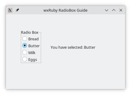
This is what the RadioBox looks like with the Wx::RA_SPECIFY_ROWS style:

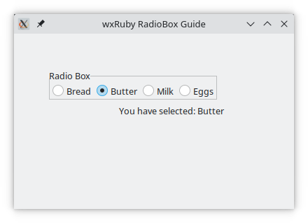
If we change this to the Wx::RA_SPECIFY_COLS style…
require 'wx'

class MyWindow < Wx::Frame
  def initialize(title)
    super(nil, title: title)
    @panel = Wx::Panel.new(self)

    values = %w[Bread Butter Milk Eggs]

    @rbox = Wx::RadioBox.new(@panel, label: 'Radio Box', pos: [50,50],
                             choices: values, style: Wx::RA_SPECIFY_COLS)
    @rbox.evt_radiobox(Wx::ID_ANY) { radio_box_event }

    @label = Wx::StaticText.new(@panel, label: 'You have selected: None', pos: [150, 100])

    centre
  end

  def radio_box_event
    rboxSelection = @rbox.get_string_selection
    @label.set_label_text("You have selected: #{rboxSelection}")
  end
end

Wx::App.run do
  window = MyWindow.new("wxRuby RadioBox Guide")
  window.show
end
It will look like this:

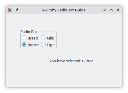
We can also make 2D RadioBoxes by keeping the value of the MajorDimension lower than the number of values. If there are 4 values, and the major dimension is specified as 2 with the style Wx::RA_SPECIFY_ROWS, then only two rows will be created.
Since there 4 values, they will be split equally between both rows.
require 'wx'

class MyWindow < Wx::Frame
  def initialize(title)
    super(nil, title: title)
    @panel = Wx::Panel.new(self)

    values = %w[Bread Butter Milk Eggs]

    @rbox = Wx::RadioBox.new(@panel, label: 'Radio Box', pos: [50,50],
                             choices: values, style: Wx::RA_SPECIFY_ROWS,
                             major_dimension: 2)
    @rbox.evt_radiobox(Wx::ID_ANY) { radio_box_event }

    @label = Wx::StaticText.new(@panel, label: 'You have selected: None', pos: [150, 150])

    centre
  end

  def radio_box_event
    rboxSelection = @rbox.get_string_selection
    @label.set_label_text("You have selected: #{rboxSelection}")
  end
end

Wx::App.run do
  window = MyWindow.new("wxRuby RadioBox Guide")
  window.show
end
This will result in the below output:

-
-
Basic Guides
-
Widget Guides
-
Drawing Guides
-
Event Guides
-