-
Notifications
You must be signed in to change notification settings - Fork 7
HowTo : TextCtrl widget
 About FAQ User Guide Reference documentation
This wxRuby guide demonstrates how to use the Wx::TextCtrl widget with it’s various styles, features and functions. A complete list of options will be included here together with code examples for your convenience.
The Wx::TextCtrl widget is quite powerful and flexible, allowing the user to input data in various way with many stylistic features.
The syntax for creating a TextCtrl widget in wxRuby is as follows:
text = Wx::TextCtrl.new(parent, id, value, pos, size, style, validator, name)Parameter descriptions:
-
parent : Wx::Window
the parent window (widget) such as a Wx::Panel. -
id : Integer
Widget ID.Wx::ID_ANYindicates a default value. -
value : String
Optional The text which you want to display in the widget. Empty by default. -
pos : Array(Integer,Integer) or Wx::Point
Optional coordinates for the position of the topleft corner of the widget. Default isWx::DEFAULT_POSITION. -
size : Array(Integer,Integer) or Wx::Size
Optional dimensions of the widget. Default isWx::DEFAULT_SIZE. -
style : Integer
Optional styling mask for the widget (such as alignment). Default is 0. -
validator : Wx::Validator
Optional Window validator. Default is nil. -
name : String
Optional window name. Default is Wx::TEXT_CTRL_NAME_STR.
Note: As with all windows, keyword constructor alternatives for all arguments but the 'parent' argument are available. See here for more information.
Available styles for the TextCtrl widget:
| Button Style | Description |
|---|---|
| Wx::TE_PROCESS_ENTER | Enables the Wx::EVT_TEXT_ENTER event to be generated. |
| Wx::TE_PROCESS_TAB | Normally the TAB key is used for keyboard navigation and pressing it in a control switches focus to the next one. With this style, this won't happen and if the TAB is not otherwise processed (e.g. by wxEVT_CHAR event handler), a literal TAB character is inserted into the control. Notice that this style has no effect for single-line text controls when using WXGTK. |
| Wx::TE_MULTILINE | If used, then the widget will allow multiple lines. |
| Wx::TE_PASSWORD | Causes the Text to appear as asterisks. |
| Wx::TE_READONLY | Makes the Text un-editable by the User. |
| Wx::TE_RICH | Use rich text control under WXMSW, this allows having more than 64KB of text in the control. This style is ignored under other platforms and it is recommended to use Wx::TE_RICH2 instead of it under WXMSW. |
| Wx::TE_RICH2 | Use rich text control version 2.0 or higher under WXMSW, this style is ignored under other platforms. Note that this style may be turned on automatically even if it is not used explicitly when creating a text control with a long (i.e. much more than 64KiB) initial text, as creating the control would simply fail in this case under WXMSW if neither this style nor Wx::TE_RICH is used. |
| Wx::TE_AUTO_URL | Highlights the URLs present in the widget, and generates Events for the URLs. |
| Wx::TE_NOHIDESEL | By default, the Windows text control doesn't show the selection when it doesn't have focus - use this style to force it to always show it. It doesn't do anything under other platforms. |
| Wx::HSCROLL | A horizontal scrollbar will be created, which disables wrapping. |
| Wx::TE_NO_VSCROLL | For Multi-Line widgets, the Vertical Scrollbar will be removed. This limits the amount of text that can be entered. |
| Wx::TE_LEFT | Causes the Text to be left-justified. |
| Wx::TE_CENTRE | Centers the text in the widget. |
| Wx::TE_RIGHT | Causes the Text to be right-justified |
| Wx::TE_DONTWRAP | Same as Wx::HSCROLL style: don't wrap at all, show horizontal scrollbar instead. |
| Wx::TE_CHARWRAP | For multiline controls only: wrap the lines too long to be shown entirely at any position (WXGTK, WXOSX). |
| Wx::TE_WORDWRAP | For multiline controls only: wrap the lines too long to be shown entirely at word boundaries (WXMSW, WXGTK, WXOSX). |
| Wx::TE_BESTWRAP | For multiline controls only: wrap the lines at word boundaries or at any other character if there are words longer than the window width (this is the default). |
Note: Some of these Styles are not available on certain platforms.
A list of useful methods which can be used on the TextCtrl widget.
| Method | Description |
|---|---|
| get_line_length(index) | Returns the length of the line at the specified index (line number) . |
| get_number_of_lines | Returns the number of lines in the Widget. |
| get_line_text(index) | Returns the contents of the line at the specified index (line number). |
| get_value | Returns all the text currently inside the Widget. |
| is_multi_line | Returns a bool value stating if the Widget is in Multi-line mode. |
| is_single_line | Returns a bool value stating if the Widget is in Single-line mode. |
| load_file(filename) | Load the content of the file at the given filepath into the Widget. |
| save_file(filename) | Saves the contents of the Widget in a file at the given filepath. |
| set_max_length(len) | Sets a maximum number of characters that the user is allowed to input. |
A list of event connector methods which can be used for the TextCtrl widget.
| Event connector | Description |
|---|---|
| evt_text | Connects handler for Wx::EVT_TEXT event which is generated whenever the text is changed. |
| evt_text_enter | Connects handler for Wx::EVT_TEXT_ENTER event which is generated whenever the User presses “Enter” in the widget. |
| evt_text_url | Connects handler for Wx::EVT_TEXT_URL, a mouse event that occurs when the cursor is over an URL. |
| evt_text_maxlen | Connects handler for Wx::EVT_TEXT_MAXLEN which is generated when the user tried to enter more text than the limit specified by the set_max_length(len) method. |
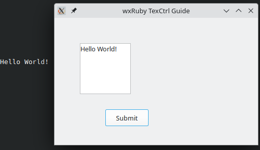
In this example we’ll setup a basic TextCtrl widget, with some custom styles.
We have applied two Styles, Wx::TE_MULTILINE, which makes the widget go from single line mode to multiple, and the Wx::TE_NO_VSCROLL style which removes the vertical scrollbar which appears by default on multi-line TextCtrl widgets.
We’ve also created a function, on_press, which prints out the text in the TextCtrl Widget. This function is called when the button is pressed.
require 'wx'

class MyWindow < Wx::Frame
  def initialize(title)
    super(nil, title: title)
    @panel = Wx::Panel.new(self)

    @text = Wx::TextCtrl.new(@panel, pos: [50, 50], size: [100, 100],
                             style: Wx::TE_MULTILINE | Wx::TE_NO_VSCROLL)

    button = Wx::Button.new(@panel, pos: [100, 180], label: 'Submit')
    evt_button button, :on_press

    centre
  end

  def on_press
    puts @text.value
  end
end

Wx::App.run do
  window = MyWindow.new("wxRuby TexCtrl Guide")
  window.show
end
The output of the above code:

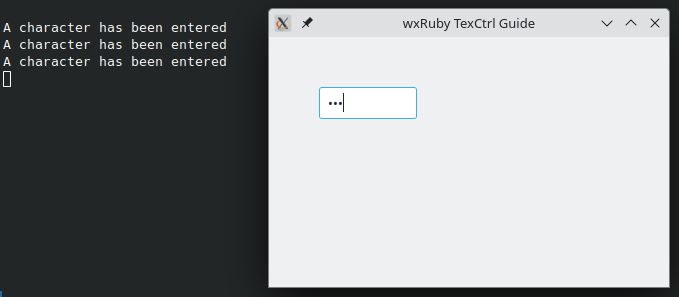
In this example we are using the Wx::TE_PASSWORD style, which is used for fields where you want to take password or other sensitive data from the user.
We also connect a handler for the Wx::EVT_TEXT event, which automatically calls the on_press function whenever the text within widget is changed.
require 'wx'

class MyWindow < Wx::Frame
  def initialize(title)
    super(nil, title: title)
    @panel = Wx::Panel.new(self)

    @text = Wx::TextCtrl.new(@panel, pos: [50, 50], style: Wx::TE_PASSWORD)
    evt_text @text, :on_press

    centre
  end

  def on_press
    puts 'A character has been entered'
  end
end

Wx::App.run do
  window = MyWindow.new("wxRuby TexCtrl Guide")
  window.show
end
This is the output: (pictured next to the console)

-
-
Basic Guides
-
Widget Guides
-
Drawing Guides
-
Event Guides
-