-
-
Notifications
You must be signed in to change notification settings - Fork 394
New issue
Have a question about this project? Sign up for a free GitHub account to open an issue and contact its maintainers and the community.
By clicking “Sign up for GitHub”, you agree to our terms of service and privacy statement. We’ll occasionally send you account related emails.
Already on GitHub? Sign in to your account
[Ready for Review] GUI - Login with GitHub #876
Conversation
Fixes #870. See that issue for details
|
@shanalikhan As you can see by the title, this PR is ready for extensive review. I just wanted to bring this to your attention because it has been a while since the release of |
|
Yes i know, give me some time. I will provide a review in detail. |
* Cleaned up toggling commented settings

* Updated to include fix by @ioprotium
|
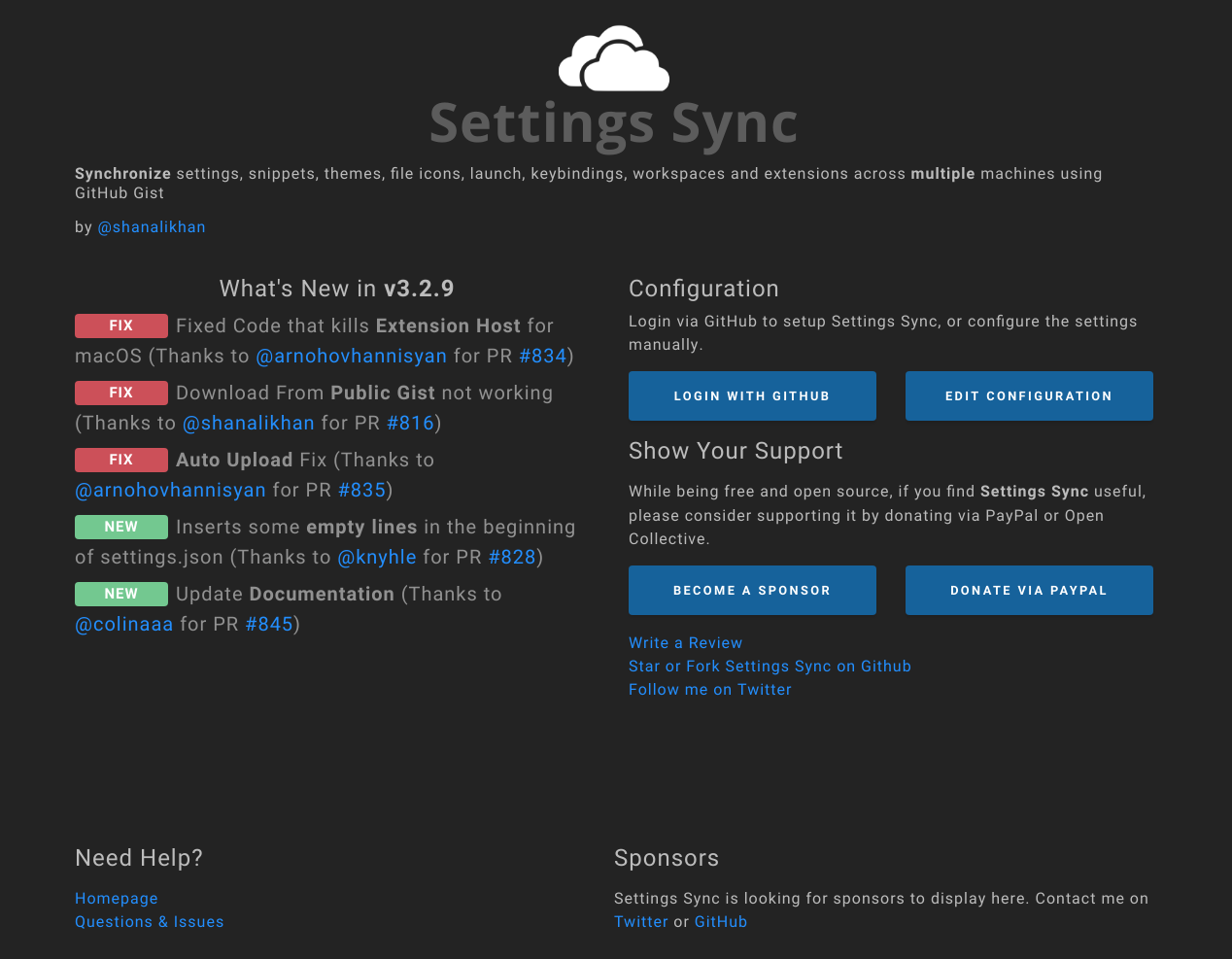
Here is the original UI layout: Overall:
Title
Description:
Two Columns
Left Column
Right Column
Below to columns
Right
Edit Configuration Page
Left Column
Right Column
Conclusion:
Thanks |
|
I built this as well to check it out. I agree with @shanalikhan about the style. It should flow with other other popular extensions that use a webview. I have a couple of notes from my experience so far:
I haven't had a chance to go over the other stuff yet. Will post more feedback when I get a chance. |
|
Overall:
Title
Description:
Two Columns
Left Column
Right Column
Below to columns
Right
Edit Configuration Page
Left Column
Right Column
Gist Selection:
Conclusion:
|
|
Let me know once you complete all the checklist so i will start the UI review. |
|
@shanalikhan I have completed your checklist. |
|
Some contrast config are changed. The page doesnt match with the theme background now. Comparing with image Also check the contrast ratio of font |
Are you sure we should match the theme background? It would be much harder to guarantee good contrast. A great example of this is the screenshot of the Bookmarks extension that you attached. The links, buttons, and images all have very low contrast and are hard to see. Therefore I suggest we leave it like it currently is (dark on dark themes, light on light themes). However, if it's absolutely necessary, I can update it to match the background (with the potential side effect of bad contrast). What are your thoughts? |
There was a problem hiding this comment.
Choose a reason for hiding this comment
The reason will be displayed to describe this comment to others. Learn more.
These are the high level reviews. I will look into it more.
|
Does |
|
@shanalikhan The css and js files are already minified, while the fonts can't be because they're binaries. Only the HTML files are left without minification, but it's probably fine because they are pretty small and minification wouldn't have a big difference on their file size. |
|
@shanalikhan I have figured out the problem, but only a temporary solution. This is caused by PR: #934 |
|
Currently the process to download the Public Gist has become very hard. Can you add a button below to Login with Github as "Download Public Gist" - Style should be like hyperlinks (not buttons). When user click that button. |


Short description of what this resolves:
This PR allows the user to log in to GitHub using a button, and the extension will automatically generate a token with the correct scopes and find the gist id.
Changes proposed in this pull request:
Fixes: #506
How Has This Been Tested?
I have tested this by logging in to GitHub and checking if the token and gist id has been saved properly.
Screenshots (if appropriate):
Checklist:
Status: