-
Notifications
You must be signed in to change notification settings - Fork 2
Localization Part 5
One of the primary goals when creating BactMAP was to make it possible to change
as much as possible in the appearance of the plots. Everybody has their own preferences in design,
and it can be very tedious to have to change for instance the colors of the plot or the size of the fonts.
For this, BactMAP's plot outputs are ggplots, which are relatively easy to change.
If you want to plot all output of a plot function in a new color, you can re-do the plotting, indicating the new color palette. However, in most cases you can also modify your plots afterwards instead.
createPLotList() has a colorpalette option. Here, you can choose from a set of colorblind friendly palettes and the viridis color palettes.
The default color palette is "GreenYellow". To see which other palettes are available, type the following in the console:
showCurrentPalettes()To for instance create the same plot as in the previous section, but using the palette "ColdBlue", type the following command:
plots_Bacillus <- createPlotList(spotdata=spots_Bacillus$spotframe,
                                 meshdata=mesh_Bacillus$mesh,
                                 colorpalette="ColdBlue"
                                 groups=5
)
If you want to use a viridis palette, also set the variable viridis to TRUE, for instance:
plots_Bacillus <- createPlotList(spotdata=spots_Bacillus$spotframe,
                                 meshdata=mesh_Bacillus$mesh,
                                 colorpalette="magma"
                                 groups=5,
                                 viridis=TRUE
)For the figures in the paper describing BactMAP, I decided to use the viridis color palettes for all heatmap plots. Because it can take time to re-do all the calculations for the plots, I often prefer to modify the colors afterwards.
I use the ggplot-function
scale_fill_viridis_c()
for this. To use ggplot2-commands, first load the package (it was already installed when you installed BactMAP):
library(ggplot2)To modify a single plot as the lengthplot, use the +-operator to add the new color scale:
plots_Bacillus$lengthplot + scale_fill_viridis_c(option="magma")
Changing the color of the grouped plots is a bit more tricky.
When you would try the same trick on the qplots, you’ll get an error
message:
plot(plots_Bacillus$qplots + scale_fill_viridis_c(option="magma"))The error message I get is Error in plot.window(...) : need finite 'xlim' values. This means so much as that the function doesn’t find the original
plots, only the projection.
For this reason, I included the list of original plots qplots_separate
in the output, so it is at least possible to modify anything you want!
To do this, we’ll need a bit more advanced coding. Remember you can re-do the plotting with a different color scale too, so feel free to skip this part!
Below, I use the functions lapply and arrangeGrob. lapply lets you go through a list, and
apply a function on whatever object is in this list. In our case, I add the new color scale to each member of
my list qplots_separate. When that's done, I use arrangeGrob from the package gridExtra to put all plots above each other in one projection.
##add color palette to the list of plots using lapply()
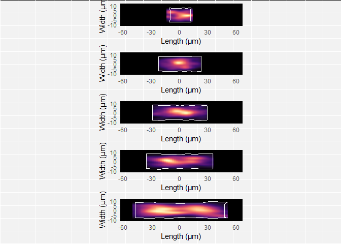
plots_Bacillus_adapted <- lapply(plots_Bacillus$qplots_separate, function(x) x + scale_fill_viridis_c(option="magma"))

##show the plots
library(gridExtra)
plots_Bacillus_adapted <- arrangeGrob(grobs=plots_Bacillus_adapted, ncol=1)

plot(plots_Bacillus_adapted)
In the figure, I also removed the axis labels, tick marks and numbers of
the qplots, because I wanted to show the plots purely as cell
projections. This is possible with the theme function of
ggplot. In general,
to remove axis text & tick marks of an imaginary plot ‘myPlot’, the
theme function looks as
follows:
myPlot + theme(axis.text = element_blank(), axis.title=element_blank(), axis.ticks=element_blank())So, if we want to do this for our list of plots, it’s a matter of inserting it in the code above; so now it 1) changes the color scheme and 2) removes the axis labels/text/ticks:
##add color palette & remove text/ticks to the list of plots using lapply()
plots_Bacillus_adapted_2 <- lapply(plots_Bacillus$qplots_separate, function(x)  x +
                                                                                scale_fill_viridis_c(option="magma") +
                                                                                theme(axis.text=element_blank(), axis.title = element_blank(), axis.ticks = element_blank()) )
##show the plot
plots_Bacillus_adapted_2 <- arrangeGrob(grobs=plots_Bacillus_adapted_2, ncol=1)

plot(plots_Bacillus_adapted_2)
| ⬅️ Localization part 4: Using CreatePlotList | ▪️ ◾ ▪️ | Localization part 6: Resources ➡️ |
|---|
