(Widget) Volume
| Option | Type | Default | Description |
|---|---|---|---|
label |
string | '{volume[percent]}%' |
The format string for the volume label. You can use placeholders like {volume[percent]} to dynamically insert volume information. |
label_alt |
string | '{volume[percent]}%' |
The alternative format string for the volume label. Useful for displaying additional volume details. |
tooltip |
boolean | True |
Whether to show the tooltip on hover. |
volume_icons |
list | ['\ueee8', '\uf026', '\uf027', '\uf027', '\uf028'] |
A list of icons representing different volume levels. The icons are used based on the current volume percentage. |
callbacks |
dict | {'on_left': 'toggle_volume_menu', 'on_middle': 'do_nothing', 'on_right': 'toggle_mute'} |
Callbacks for mouse events on the volume widget. |
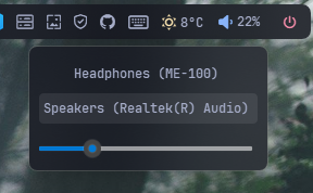
audio_menu |
dict | {'blur': True, 'round_corners': True, 'round_corners_type': 'normal', 'border_color': 'System', 'alignment': 'right', 'direction': 'down', 'distance': 6} |
Menu settings for the widget. |
animation |
dict | {'enabled': True, 'type': 'fadeInOut', 'duration': 200} |
Animation settings for the widget. |
container_padding |
dict | {'top': 0, 'left': 0, 'bottom': 0, 'right': 0} |
Explicitly set padding inside widget container. |
volume:
  type: "yasb.volume.VolumeWidget"
  options:
    label: "<span>{icon}</span> {level}"
    label_alt: "{volume}"
    volume_icons:
      - "\ueee8"  # Icon for muted
      - "\uf026"  # Icon for 0-10% volume
      - "\uf027"  # Icon for 11-30% volume
      - "\uf027"  # Icon for 31-60% volume
      - "\uf028"  # Icon for 61-100% volume
     audio_menu:
       blur: True
       round_corners: True
       round_corners_type: 'normal'
       border_color: 'System'
       alignment: 'right'
       direction: 'down'
       distance: 6
    callbacks:
      on_left: "toggle_volume_menu"
on_right: "toggle_mute"-
label: The format string for the volume label. You can use placeholders like
{volume[percent]}to dynamically insert volume information. - label_alt: The alternative format string for the volume label. Useful for displaying additional volume details.
- tooltip: Whether to show the tooltip on hover.
- volume_icons: A list of icons representing different volume levels. The icons are used based on the current volume percentage.
-
audio_menu: A dictionary specifying the menu settings for the widget. It contains the following keys:
- blur: Enable blur effect for the menu.
- round_corners: Enable round corners for the menu (this option is not supported on Windows 10).
- round_corners_type: Set the type of round corners for the menu (normal, small) (this option is not supported on Windows 10).
- border_color: Set the border color for the menu (this option is not supported on Windows 10).
- alignment: Set the alignment of the menu (left, right).
- direction: Set the direction of the menu (up, down).
- distance: Set the distance of the menu from the widget.
-
callbacks: A dictionary specifying the callbacks for mouse events. The keys are
on_middleandon_right, and the values are the names of the callback functions. -
animation: A dictionary specifying the animation settings for the widget. It contains three keys:
enabled,type, andduration. Thetypecan befadeInOutand thedurationis the animation duration in milliseconds. - container_padding: Explicitly set padding inside widget container. Use this option to set padding inside the widget container. You can set padding for top, left, bottom and right sides of the widget container.
.volume-widget {}
.volume-widget .widget-container {}
.volume-widget .label {}
.volume-widget .icon {}.volume-slider {
border: none;
}
.volume-slider::groove {}
.volume-slider::handle{}
.audio-menu {
background-color:rgba(17, 17, 27, 0.4);
}
.audio-container .device {
background-color:transparent;
border: none;
padding:6px 8px 6px 4px;
margin: 2px 0;
font-size: 12px;
border-radius: 4px;
}
.audio-container .device.selected {
background-color: rgba(255, 255, 255, 0.085);
}
.audio-container .device:hover {
background-color: rgba(255, 255, 255, 0.06);
}