Getting Started
Hover UI Kit uses 3D cursors to interact with button and slider items. Cursors typically attach to 3D points provided by 3D input devices. Items react to cursors based on the distance between them, and item selection events occur when the cursor stays near to an item for a short period of time.
There are various item types available, such as selectors, checkboxes, radio buttons, and sliders. All item types share common rules and behaviors. Of course, each type differs from the others in some way, including the data that the item maintains and the events that it exposes.
Items can be created individually or as part of a larger interface system (like the "Hovercast" hand menu). The item's events, behaviors, and customizable visuals remain the same, regardless of the structures that contain them.
Items can be placed anywhere in a scene, either in global space or attached to the coordinate space of some other (potentially-moving) object. Items can be positioned individually, or can be arranged automatically within a layout.
Please review the licensing details for the Hover UI Kit project. There are some scenarios where usage is free, some where usage requires permission, and others which require a formal/paid licensing agreement. In any case, don't hesitate to email the developer about project and usage ideas!
Download the latest release build, including any optional modules, then import these packages into your Unity project. See details on the Releases and Packages page (recommended).
Click the following links to view step-by-step instructions for getting started. Each page uses an animation to visually demonstrate the performance (and result) of these instructions.
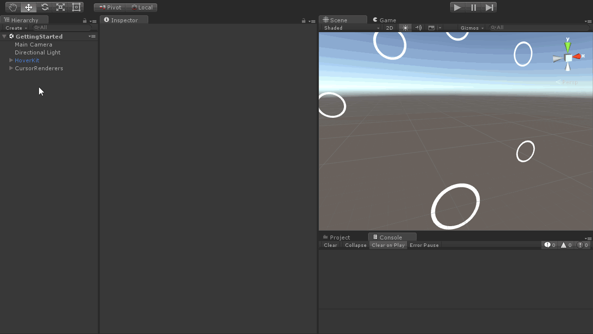
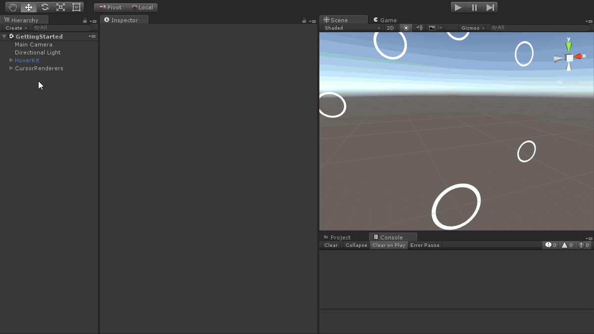
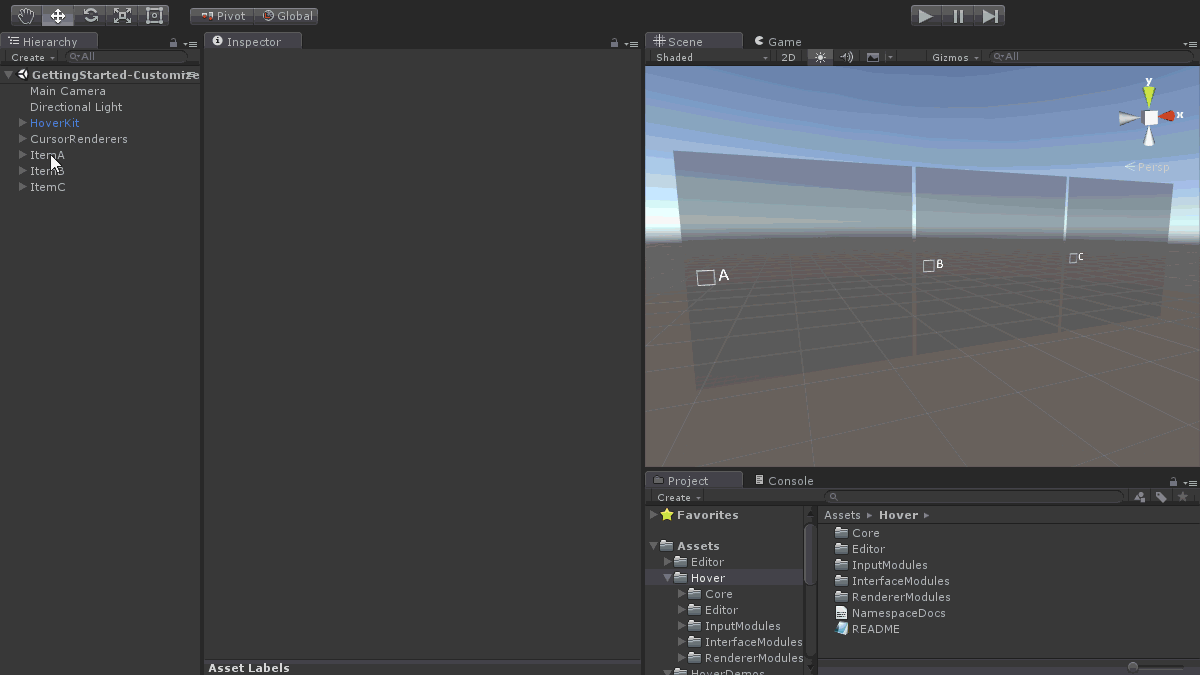
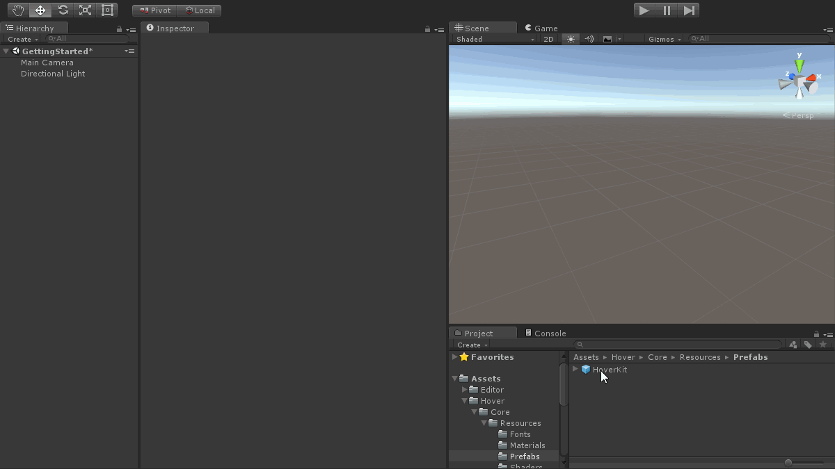 📷 Adding the manager prefab and cursor renderers to a scene
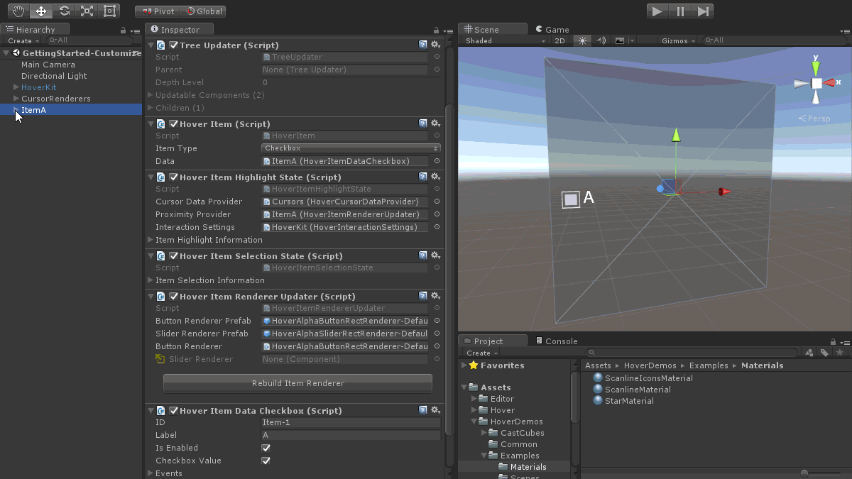
 📷 Building a new checkbox item
 📷 Building a new slider item
 📷 Using cursors to interact with items (in a playing scene)
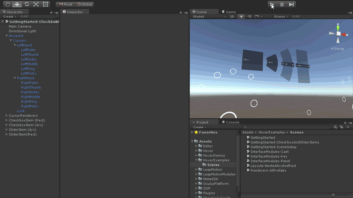
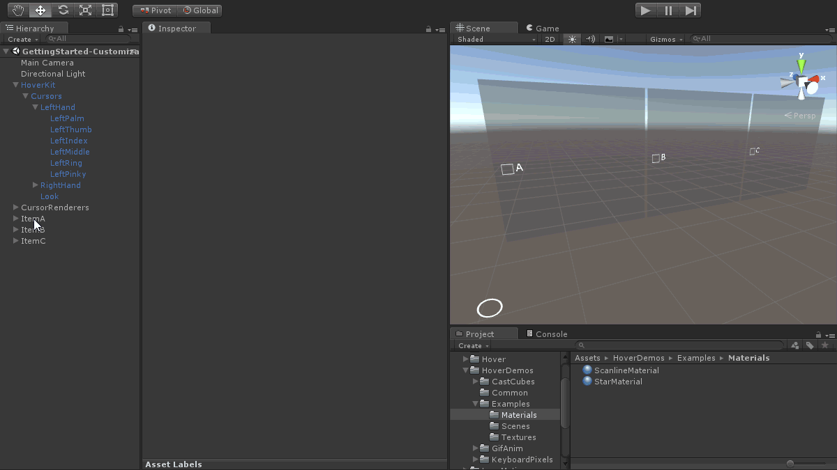
 📷 Arranging items manually, within a row layout, and within a nested column layout
 📷 Setting new item renderer materials and testing them in the editor
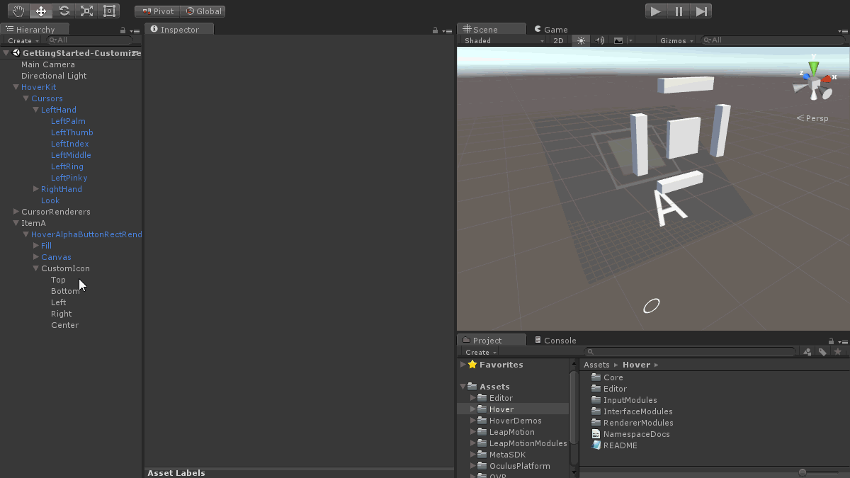
 📷 Modifying the default item renderer's labels and icons
 📷 Modifying the default item renderer's canvas elements
 📷 Adding components to dynamically animate a 3D icon