Interface Modules꞉ Panel
The Hoverpanel interface provides an rectangular-shaped, hierarchical menu structure that can be placed anywhere in the virtual world. It displays one rectangular-shaped row of items at a time, and (upon item selections or other events) smoothly animates transitions between these rows.
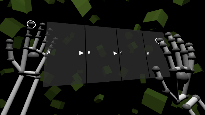 📷 Using the Hoverpanel interface with Leap Motion hands
The "Panel" input module is contained in the /Assets/Hover/InterfaceModules/Panel folder.
Use a "builder" component to generate this interface in your scene:
- Create an empty GameObject named Hoverpanel.
- Add the
HoverpanelBuildercomponent to Hoverpanel.- Modify the properties, if necessary.
- Click the "Build Interface" button.
- Modify the properties, if necessary, within the newly-generated components.
See the Hover.InputModules.Panel namespace for technical reference, and /Assets/HoverExamples/Scenes/InterfaceModules-Panel.unity for an example scene.
The Hoverpanel interface has one active row (of type HoverLayoutRectRow) at a time, and switches between rows automatically during navigation events. Before starting a scene, the active row determines which row will be visible when the scene starts. To change the active row:
- Find the
HoverpanelInterfacecomponent (attached to the main Hoverpanel object).- Set the "Active Row" property to the desired
HoverLayoutRectRowcomponent.
- Set the "Active Row" property to the desired
- Disable the previously-active row's GameObject to hide it, so that it does not overlap the newly-active row.
The Hoverpanel interface is most useful when there are several rows of items, and the user can navigate between those rows. To add a new row:
- Create an empty GameObject named MyRow, as a child of the Hoverpanel/RowRoot object.
- Add the
HoverLayoutRectRowcomponent to MyRow. - Create items as children of MyRow (see Getting Started for instructions).
- Add the
HoverShapeRectcomponent to each item.
- Add the
Hoverpanel is a hierarchical menu interface, where each level of the hierarchy is a row layout. Typically, an item selection is the trigger for a navigation action. When discussing navigation: a "back" action means moving toward the root row, and a "forward" action means moving deeper into the hierarchy.
The following steps describe how to connect an item's selection event to Hoverpanel's row-switching method, attach navigation information to the item, and adjust the item visually:
- Select the item that will trigger the navigation.
- Add the
HoverpanelRowSwitchingInfocomponent to the item.- Choose the target row (a
HoverLayoutRectRowcomponent) for the "Navigate To Row" property. - Adjust the "Navigate Back" and "Row Entry Transition" properties, if desired.
- Choose the target row (a
- Find the item's
HoverItemDataXcomponent, whereXis the item type (for example,HoverItemDataSelector).- Open the "Events" foldout section.
- Add an "On Selected Event" that points to
HoverpanelInterface.OnRowSwitched(). - Adjust the "Action" property to make the item's "arrow" icon appear. Recommended: use "Navigate In" for "forward" actions, and "Navigate Out" option for "back" actions.
- Find the item renderer's
HoverCanvascomponent (attached to the Canvas object within the renderer).- Adjust the "Alignment" property to set the position of the "arrow" icon. Recommended: use "Text Left And Icon Right" for "forward" actions, and "Left" for "back" actions.
By default, the HoverpanelBuilder component will create example rows. These rows contain items that are configured for "back" and "forward" navigation.
The HoverShapeRect component (attached to the main Hoverpanel object) has properties that control the interface's size.
The HoverpanelRowTransitioner component has properties that affect the interface's row-switching animations.